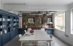
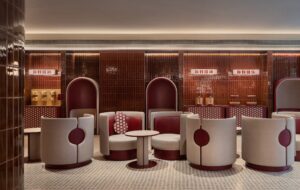
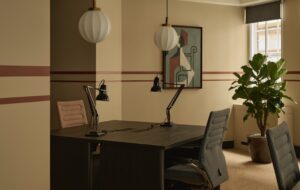
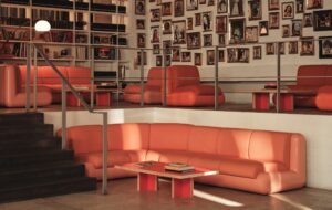
 |Podium seating, one of a broad mix of breakout spaces along The Bridge|Cross-laminated timber was chosen because it could be quickly prefabricated|Acoustic fins on the walls and ceiling break up blank surfaces|Desks sit next to the long bank of windows, with The Bridge above|The kitchen – before, staff had been known to eat in their cars|Hand-blown glass baubles bob through the space like bubbles|High-octane displays line the showroom|Calm meeting space, lined with pleated paper|Office bathrooms are a cut above your usual melamine cubicle||
Occupying an unglamorous patch next to the Dartford Crossing, the new headquarters for bathroom suppliers Crosswater Group and Bathroom Brands is a diamond in the rough. From the outside it is another of the area’s large warehouses, and a large portion of the building is just that; but for the offices and showroom, design director Nico de Beer wanted something unexpected. “We didn’t want the awful standardised offices you usually get in a warehouse,” he explains, “so we got two architects to implant a building within a building.”
Threefold Architects was tasked with designing the workspace and communal areas, while Coppin Dockray Architects tackled the showroom and all-important bathrooms; and it all had to happen in just eight months. Threefold kicked off by interviewing the staff about their previous workplace, and uncovered some depressing home truths. “We found a lot of people had lunch in their cars because the only recreational space was a windowless canteen,” explains Matthew Driscoll, director at Threefold, “and people weren’t having meetings because there was only one big boardroom. So this [office] was designed around orchestrating interaction and fostering connectivity.”
Taking on a tricky canvas of two 60m-long floorplates with one wall of windows, the practice
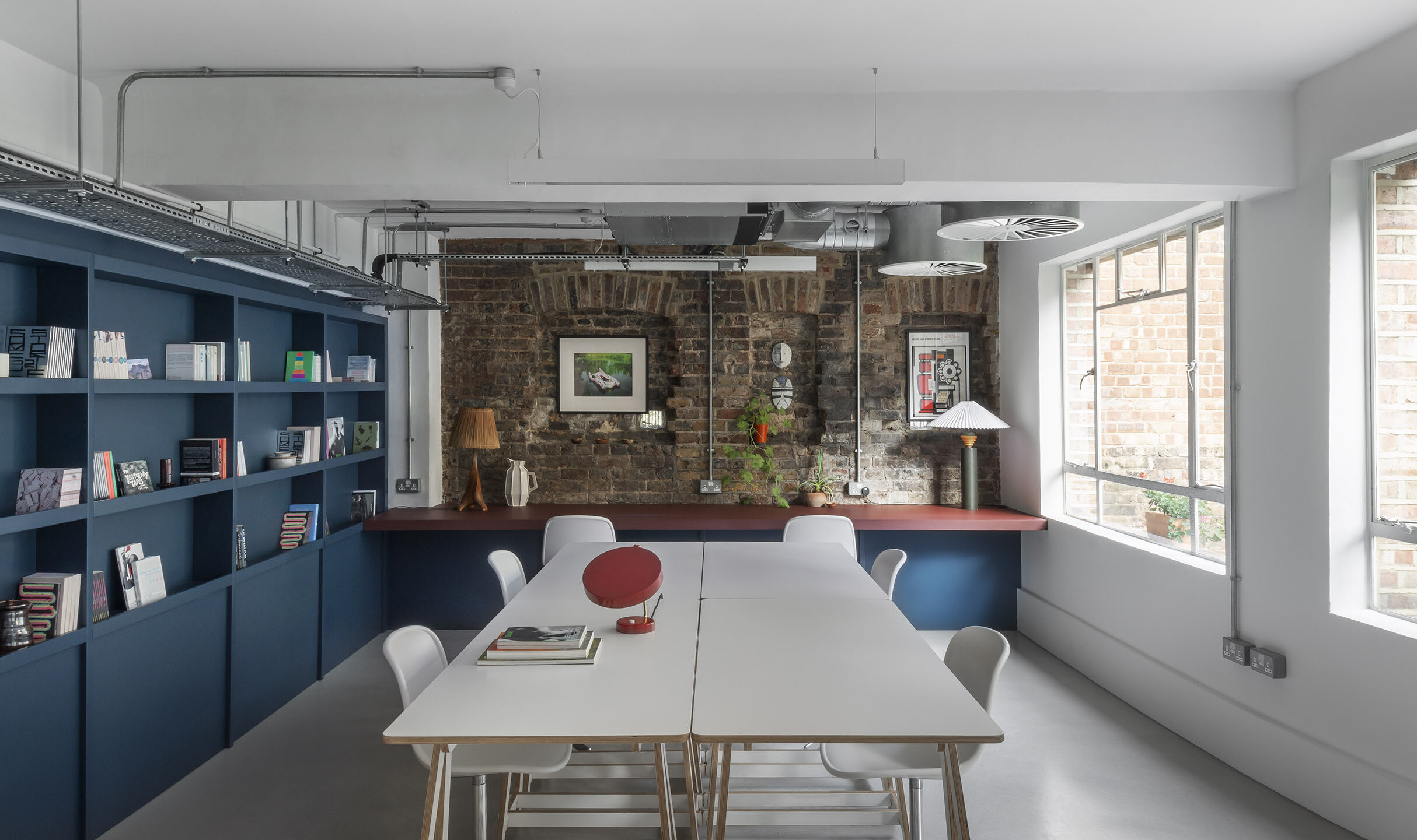
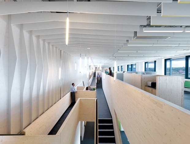
split the lengths in half, placing banks of desks at the window-side, and building a new cross-laminated timber (CLT) structure on the other. Threefold has coined this The Bridge, apparently inspired by the bustling atmosphere of Florence’s Ponte Vecchio – but it’s also a nod to its Dartford neighbour. It not only connects all areas of the office via a mezzanine level, it is also punctuated with a range of spaces for staff to meet and work. Tucked around and underneath the structure are private booths, banquettes for small meetings, kitchenettes and even a forum for larger meetings or presentations. It cleverly breaks up the open space, giving the 70-odd office staff diversity of environment and privacy when they need it.
“We wanted [The Bridge] to be expressive in its dynamism, to have a domestic scale and warmth, and we needed something quick,” says Driscoll. CLT is normally used as a construction material, so could be pre-fabricated and assembled on site in under two weeks. It was perfect, he says, because the structure and the finish are one and the same.
Also designed to dispel the warehouse feel are the undulating ceiling and wall fins, which carve the space into something more ambient and intimate, and help control acoustics. “It breaks up the linearity but allows you to get a sense of the volume,” says Driscoll. Pendant lights dangle at varying heights to enhance this calm, cosy atmosphere, and change according to natural light levels – a feature that helped the project achieve a BREEAM Excellent rating.
At one end of the office are the social spaces, a 1950s-diner-style games room and bar with ping-
pong tables and arcade machines; and a further cafe and kitchen, more serene and in keeping with the
rest of the office, with an expansive terrace overlooking the landscape. “A building is a community,” says de Beer. “We have to cater to everyone, from the warehouse staff to the accounts people, and make it an environment they’re all proud of.”
Similarly the bathrooms aim to showcase the company’s products to staff and visitors alike. Each one incorporates a different range, with interiors themed accordingly. So, for example, a traditional sink and tap range is complemented by a giant mural of an 18th-century painting by Surface View, chequered tiles and ornate wall lights, while others have a more contemporary mood. This creative use of the product hints at what’s ahead in the showroom, which is sited at the other end of the offices.
Visitors walk through the light, calm, low-tech offices to the showroom, where they’re thrown into
a dramatically opposing environment. Through the double doors is a dark, circular room, with a central installation curtained by an inventive use of a bathroom plug chain. Passing through, sensors trigger showers and spotlights to turn on within the installation, and classical music starts playing. “It’s purposely disorientating,” says Sandra Coppin, director at Coppin Dockray. “You leave everything behind, your anticipation is risen, and your senses are heightened.”
Beyond this theatrical beginning is a 90m-long, 10m-wide showroom that’s more like a promenade, divided into room-sets displaying the company’s wares. Unlike many showrooms, it’s not a visual overload of stuff, but a carefully curated gallery. Baubles decorate the ceiling and lead you through the space, like “bubbles down a plug hole,” says Coppin. They cluster in key spots, like the meeting space, which has sound-dampening pleated paper walls (made by Canadian firm Molo) and is threaded with LEDs, its calm diffused light instilling an atmosphere conducive for talking. Details like this display how the showroom, like the office next door (albeit in very different fashion), rethinks the stereotypes with a refreshing focus on people and their interaction.

