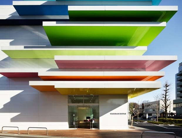
 |Emmanuelle Moureaux|Sugamo Shinkin Bank, Nakaaoki branch (2014)|Sugamo Shinkin Bank, Nakaaoki branch (2014)|Sugamo Shinkin Bank, Ekoda branch (2012)|Mille-Feuille storage series (2013)|Mille-Feuille was designed for German furniture manufacturer Schonbuch|Sugamo Shinkin Bank, Ekoda branch (2012)|Sugamo Shinkin Brank Ekoda merges the interior and exterior with 48 coloured sticks|Sugamo Shinkin Bank, Tokiwadai branch (2010)|100 Colours, Shinjuku Central Park (2014)|Venice Architecture Biennale (2014)|Venice Architecture Biennale (2014)|Uniqlo window display (2014)|Tokyo Designers Week (2014)||
Paris-born, Tokyo-based Emmanuelle Moureaux is ‘colouring’ Tokyo with her architecture, interiors, fashion and installations and her concept of ‘shikiri’.
What draws you to the vivid spectrum of colours you use in your work?
When I first visited Tokyo in 1995, I was fascinated by all the colours floating in the street – store signs, flying electrical cables, blue sky between buildings. These elements were layered giving depth to the space and became the inspiration behind my design concept of ‘shikiri’ – to create or divide space using colours.
I use colours as three-dimensional elements, like layers, to create space, not as a finishing touch applied to surfaces. But the overflowing effect of colours with ‘shikiri’ also adds layers of human emotion.
Please can you tell me about your recent design for the Sugamo Shinkin Bank Nakaaoki branch?
The Sugamo Shinkin Bank Nakaaoki branch is located on the corner of a major intersection, where there is a frequent movement of cars, bicycles, and people. I wanted the nature to be visible from the exterior. I designed the façade to be a rhythmical, changing expression as people view it from different angles.
Colours appear from the rhythmical repetition of cubes. Small, elevated gardens are built inside 12 cubes, where the seasonal changes in nature are reflected by seasonal flowers like marigold, lavender, and growing trees such as olive tree.
I wanted people to enter the bank not only because they have a purpose, but also to have a little moment to rest. I want them to feel relaxed and refreshed, like being at a park.
Does your approach to colour vary depending on type of project you’re working on, be it a bank, a kids’ cooking school, a park installation or a dress?
No, my approach is the same. I am always on a journey between different scales, from product and interiors to architecture and there are no specific boundaries.
I am an architect, but also an artist. As an architect, I plan, solve problems, and try to create better solutions for the users. But my use of colour is instinctive and this is why my works seems to have undefined border between the two.
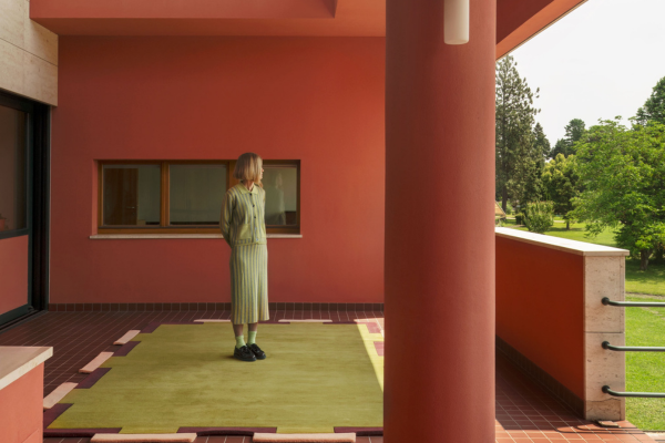
The first thing I decide when I start a design is the number of colours, depending on different factors. For example, there are 24 colours for the Sugamo Shinkin Bank. Because most financial institutions only have one or two corporate colours and I wanted to give a soft, welcoming image, I choose to use the whole range of colours – yellows, pinks, browns, greens, blues, purples – six color families, comprised of four tones.
Is it harder to use colour on a large scale?
To use color on a large scale you need to be courageous. To use color on a large scale in a sculptural way you need to be even more courageous!
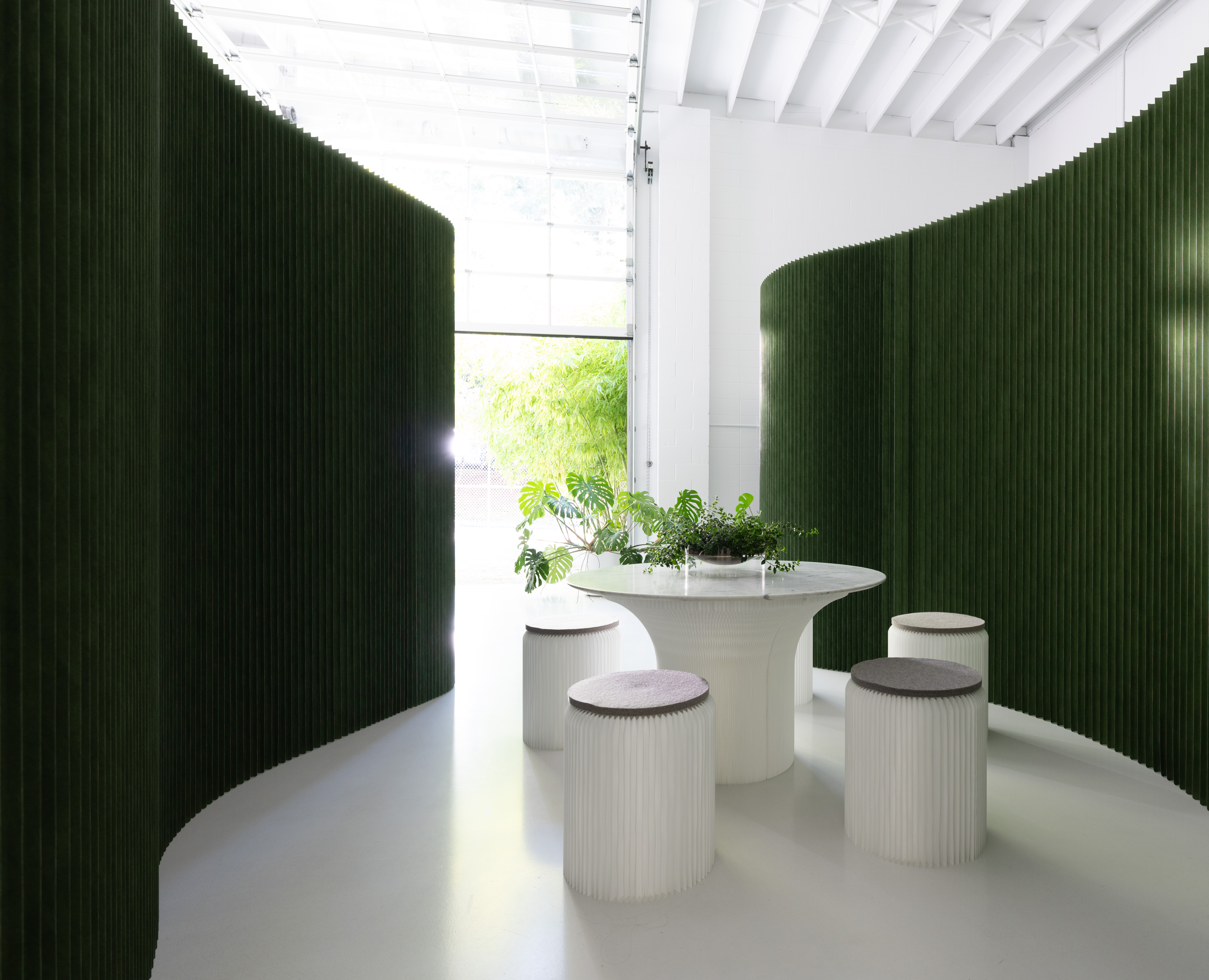
Scale does not restrict my design. The Sugamo Shinkin Bank Shimura branch, for example, also known as “Rainbow mille-feuille”, was remodeled for the Mille-feuille multi-drawer unit (2013). The interlocking modular artwork, Toge (2011) has been explored spatially in Bloom Bloom Bloom (2012), and I wish to develop the idea of Toge into architecture in the future.
How has your use of colour evolved?
‘Shikiri’ has evolved overtime. The concept, inspired by the Japanese traditional screens, started with surface elements in projects such as 100 Colours, Kaleidoscope, Bodies and Arp Hills, and has developed to line elements, such as Sticks, the Shibafu table, Eda, Toge and so on. I am always trying to develop new forms of color.
Your work is inspired by Tokyo. Which other cities would you like to bring some colour to?
Paris and London!
Do you think your native France would be receptive to such colourful buildings or designs?
Colour gives emotion. If people have the chance to experience that, I think everybody could be receptive to.
Are there any existing buildings you think could do with a bit of colour?
I believe any kind of building could change or be more attractive with colours – they can give a totally different impression and atmosphere. Having said that, every architect produces work with their philosophy, just like I do, so I’d feel a little hesitant about applying my colours to existing buildings.
My 100 colours projects, however, involves temporary installations that ‘layer’ 100 colours onto an existing context to create a fusion. I’d want my 100 colours to travel to different cities around the world.
Do you think you’ll ever get bored of bright colours?
The colours of Tokyo inspire me every day and give me energy. I won’t be bored of such beauty.

