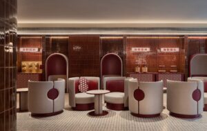
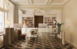
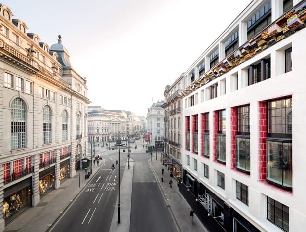
 One Eagle Place is a modern counterpart to its opposite neighbour|Richard Deacon’s cornice, influenced by brash, colourful Piccadilly Circus|Stephen Cox’s mystical figurative sculpture|Blood-red detailing in reception stands out against white walls|The classically inspired facade on the Eagle Place side of the building||
Following Eric Parry Architect’s win at the recent BCO awards for best commercial workplace with One Eagle Place, onoffice revisits the £45m project that provides a modern counterpoint to the classical architecture surrounding it.
Architect Eric Parry doesn’t shy away from complex and challenging projects. One of his most recent is a mixed-use scheme in London that combines offices, shops and 16 apartments, and straddles conservation areas in Regent Street and St James’s.
One Eagle Place is a sequel of sorts to an ambitious Mayfair office that Parry completed in 2009, which successfully dovetailed a new, contemporary-looking,
bottle-green ceramic facade with its immediate neighbour – ultra-traditional leather goods shop F Pinet. A similar principle and aesthetic prevail at One Eagle Place, but if anything it’s even more elaborate.
A joint venture by The Crown Estate and the Healthcare of Ontario Pension Plan, it occupies a block bounded by Piccadilly to the north, Jermyn Street to the south and Eagle Place to the east (with 32 listed buildings in the immediate vicinity), the building’s pièce-de-résistance is a 25-metre-long, ivory-coloured faience (glazed earthenware) facade that has been largely influenced by the unapologetically brash, pop aesthetic of Piccadilly’s digital ads.
Three buildings originally occupied the same space, so the new facade has simplified this elevation, and made it look monolithic. The facade also features a multicoloured cornice by artist Richard Deacon, while the double-height windows fronting the second and third floors are bordered with a red and white brick pattern that, speckled and graduating to cream, resembles airbrushing. The facade, says Parry, is designed to reflect the “polychromy and artifice” of Piccadilly Circus. He means this literally, too: on the day I meet him for a tour of the building, he takes me up to the second-floor office where we look out of one window.
“At dusk the ads are reflected on the ceramic surface,” he says. Parry also compares its red details to “make-up”, and describes them as “sensuous”. I venture that the mottled red glaze resembles fizzing Coke – appropriately, given Piccadilly Circus’s massive Coca-Cola ad. He seemed surprised, saying he’d never thought of that, but then the facade’s abstract decoration leaves it open to interpretation.
This is just one view though, since the windows run round three walls. When I visited, only one of the vast, open-plan offices was occupied. “We designed them as generic spaces that occupants can carve up as they see fit,” says Parry. “They can be open-plan or cellular. What I like about them is the hugely different views you get from them depending on which street you look on to.” One of the offices has extra electrical power and as such has the potential to be a trading floor.
The facade is a bold statement in the context of the area’s 19th- and 20th-century architecture, including the neo-baroque Le Méridien Piccadilly hotel, designed in 1908 by Richard Norman Shaw, on the other side of Piccadilly. Interestingly, Parry sees his facade as, above all, pop (“I find it more artificial than crafted”) but this seems an exaggeration, however, since it also has historical associations, not to mention a distinctly arty air. After all, ceramic facades were popular with art nouveau architects such as Antoni Gaudí, and Parry’s collaboration with Deacon highlights his interest in fusing art and architecture.
Parry put forward several artists, including Fiona Rae and the late Cy Twombly, to undertake the commission, and a panel of judges, among them art historian and critic Richard Cork, and Paul Moorhouse, 20th century curator at the National Portrait Gallery, finally chose Deacon. Incidentally, another less successful, arty addition has been made to the facade on the corner of Eagle Place and Jermyn Street – a gilded sculpture of a head that expresses its creator Stephen Cox’s interest in Eastern mysticism. It’s pretty but looks tacked-on and superfluous.
As for the ceramic facade, this doesn’t stick out like a sore thumb, striking though it is. Indeed, a major concern for Parry was that it should blend harmoniously with the adjoining buildings. At one point, we walk over to the statue of Eros where he points out that the facade’s strong vertical lines complement the emphatic horizontal ones on the nearby Grade I-listed, art deco building occupied by Waterstones, designed in the 1930s by Joseph Emberton and formerly department store Simpsons of Piccadilly.
In fact, a crucial aspect of Parry’s work is urban planning and One Eagle Place is no exception. Eagle Place itself “used to be a rat run, an unprepossessing place”, he says, so he renewed the paving and removed several disused phone boxes and feeder pillars (the metal boxes that contain electrical services). Moreover, the retail units on Jermyn Street have been sensitively redesigned to be smaller than the three new ones on Piccadilly, one of which – nice detail this – once housed a clothing store owned by Sacha Baron Cohen’s father. The smaller units work well with the more bijou scale typical of Jermyn Street’s shops, says Parry.
Another key strand of his work is renovation. On the corner of Eagle Pace and Piccadilly stands an 1880 building faced in Portland stone which was retained because, says Parry, “it’s considered of some architectural merit”. But Parry had its stone facade removed, restored off-site, then replaced block by block.
In fact, One Eagle Place constitutes a huge jigsaw of elements, including apartments found behind an 1890s facade on Jermyn Street and one dating from 1918 on Regent Street. The interiors of the former are relatively traditional, “mirroring the old-world ethos of Jermyn Street”. They boast parquet flooring, classical door handles and panelled doors chosen by Parry’s eponymous practice, which also designed all the apartments’ interiors. The other apartments are clean-lined – serene, all-white, with wooden shutters inside the windows.
“They have a Parisian look,” says Parry, who wanted to get away from what he caustically calls “terminal brown” – his term for “the idea of five shades of brown first introduced by [interior designer] Christian Liaigre and now a cliche”. Who will the apartments appeal to? “People who want to be in central London, in the thick of it.”
Sustainability was another concern of Parry’s. Accordingly, construction waste was minimised, and the block now has a building management system, photovoltaic panels, and also harvests rainwater. Parry informs me the block is well-insulated and has a ground-source cooling system. The project has achieved an BREEAM Excellent rating.
With a ceramic facade also gracing Parry’s Mayfair office, this feature has clearly become a hallmark of his work. Why? “Ceramic facades have depth, they’re voluptuous,” he replies. “I’m against the shallow epidermis of much contemporary architecture.” And Parry is not alone: several other architects working today, such as Herzog & de Meuron and Basel-based Manuel Herz, have relished cladding buildings with ceramic tiles to ornamental effect. One Eagle Place is a welcome addition to this new trend.
First published in onoffice magazine issue 81, December 13/January 14

