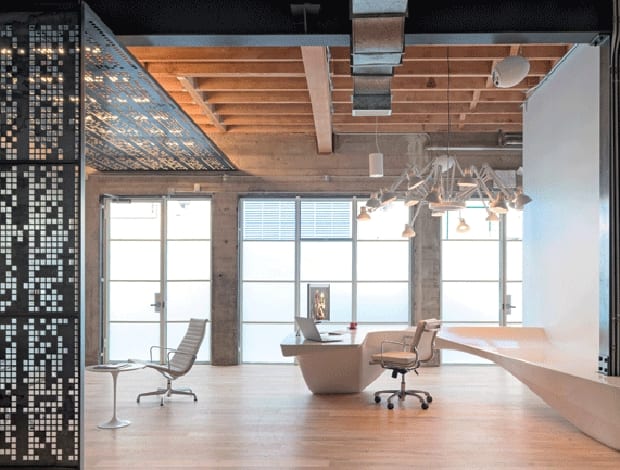
 O+A’s brief was to mix 1960s sci-fi with a raw workshop aesthetic|It all goes a bit sic-fi ski lodge in the upstairs lounge area||Glass-box meeting space gets a twist with Death Star artwork|Nerdy: a steel screen shows the opening lines of Star Wars in binary code|||
Studio O + A takes inspiration from 1960s sci-fi films and mixed it with a raw workshop aesthetic to create Giant Pixel’s first office.
The success of tech entrepreneurs like Mark Zuckerberg has triggered a nerd revolution. Formerly laden with negative connotations, the term ‘nerd’ – specifically of the web developer variety – now denotes smart young visionaries, reshaping how the world communicates, and making a lot of money doing it. So it’s no wonder the founders of gaming software developer The Giant Pixel Corporation are happy to place themselves in that pigeonhole.
“They are self-professed nerds,” declares Denise Cherry, principal and director of design at Studio O+A, which has designed Giant Pixel’s offices in San Francisco (where else?). “They’re very proud of their nerd-dom.”
What she goes on to explain, though, takes nerd-dom to a new level. In reception stands a perforated steel screen, which to the untrained eye looks like a pixelated motif. A play on the company name, perhaps? Guess again.
“We worked with them to develop an app that turns text into binary code, which is arranged into a pattern on that screen,” she explains. “So if you can read binary code, that screen shows the opening lines of Star Wars.”
This feature exemplifies how Studio O+A tackled an unusual task for this young company’s first ever office. Giant Pixel actually approached the practice before it even had a name, let alone a corporate identity on which to base the design.
“They were only really just learning about themselves as a company,” explains Cherry. “So it became about creating a space around the aesthetics of the building and the personalities of the founders.”
Working closely with the founders, the practice not only gleaned a universal love of Star Wars, but also two distinct visual preferences that were at direct odds with one another. One, a workshop feel with raw wood and industrial materials; the other, slick, retro-futuristic 1960s design. So the practice chose to marry the two.
“They’re really interested in craft in the workplace – knowing how something was made”
The building is a freestanding, three-storey, early 20th century former printing press in an up-and-coming neighbourhood of the trendy South of Market district.
When Giant Pixel acquired it, it was a shell with no internal walls, so the practice worked with existing features such as concrete walls and pillars and an exposed wooden beam ceiling to create a basis for the desired aesthetic mixture, adding more high-end finishes like white oak floors and high-spec furniture to balance it out. In reception, white leather chairs from Knoll and a white Dear Ingo chandelier from Moooi tell the contemporary side of the story, contrasting with the more industrial backdrop. Specially commissioned features such as the screen, which is made from waterjet-cut, cold-rolled blackened steel, juxtapose the sweeping sculptural form of the concrete reception desk – additions that bring individuality into the space.
“They’re really interested in craft in the workplace,” says Cherry, “knowing how something was made, and that it was made specifically for them.”
Beyond reception is half of the core workspace, an open-plan area with desks for ten employees along one wall, which is coated with writable back-painted glass for doodling/brainstorming. Desk space isn’t huge (both here and in the other half of the workspace upstairs) but all 20 staff, both engineers and administrators, are encouraged to use the range of alternative work areas, so as not to stagnate.
On the same floor is a long, high table with high stools, used for meetings, as a standing desk – offering a change of posture – or a bigger surface for tasks that need more space.
For a more secluded spot, upstairs there are two semi-enclosed cabanas for small groups to meet more privately or get away from the open workspace to conduct heads-down work.
These were custom-made in wood and grey felt, a soft, warm but essentially clean-lined, industrial material that fits well with the scheme’s mix of aesthetics, and provides effective sound-absorption. For private formal meetings, there’s also a glass-box conference room on each floor.
“You have different conversations in different types of spaces”
Also on the top floor is the lounge, a much more relaxed collaboration space complete with wool rug and ultramodern stove from Fireorb.
“You have different conversations in different types of spaces,” says Cherry. “This area is for ideation or a casual chat in somewhere more comfortable.”
Workers can get away from the desk, settle into Jehs + Laub-designed Shrimp chairs (from Cor) or Herman Miller’s Nelson Coconut Lounge chair, talk and sketch out ideas on another of the back-painted glass walls.
One must-have request made by Giant Pixel was for a bar, and the basement seemed the ideal setting. With no natural light coming in, the floor couldn’t be used for workspace, Cherry explains, but the client loved the speakeasy-style idea of having a bar down here. The mix of materials continues with Emeco bar stools made in ash and aluminium, a concrete bar, brown leather banquette seating and Orb chandeliers from Sonneman diffusing the otherwise overwhelming amount of wood.
The bar is used for everything other than regular work: lunch, dinner, drinks, meetings, events, talks and, most importantly, socialising – something intrinsic to Giant Pixel’s culture. “For them, work and play are mixed, more than for most people,” says Cherry. On display is the founders’ collection of whisky and bourbon, arcade games, and there was even a foosball table included in the plans. Happy hours are frequent.
For a young company trying to establish itself in a busy market of start-ups, this space is invaluable when it comes to recruiting the best talent. In fact, according to Cherry, this was a major consideration for the whole project.
“It’s a great way to sell their company and their culture without necessarily having to say it,” she says. “You can just walk in and see what it’s like to work here.”

