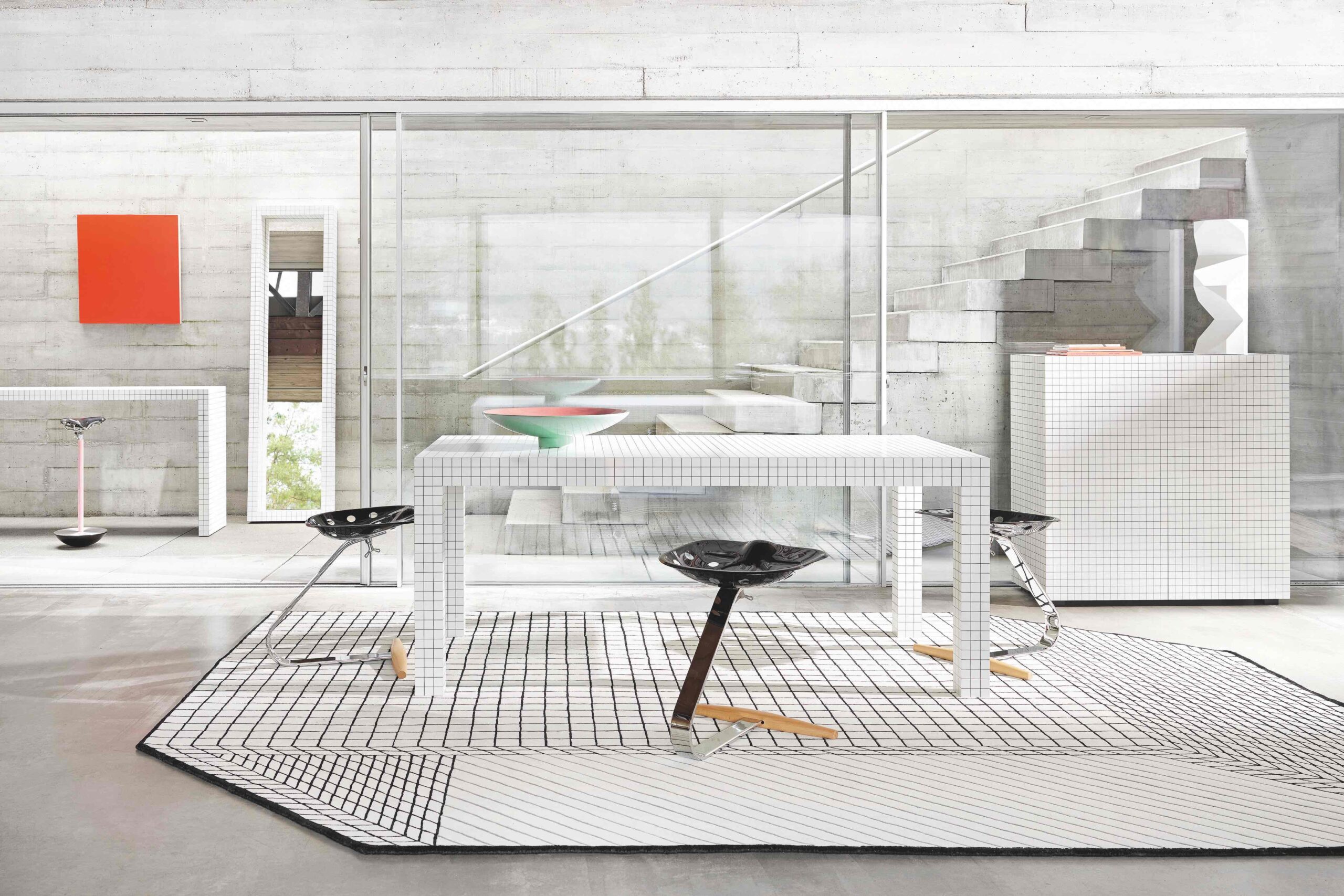
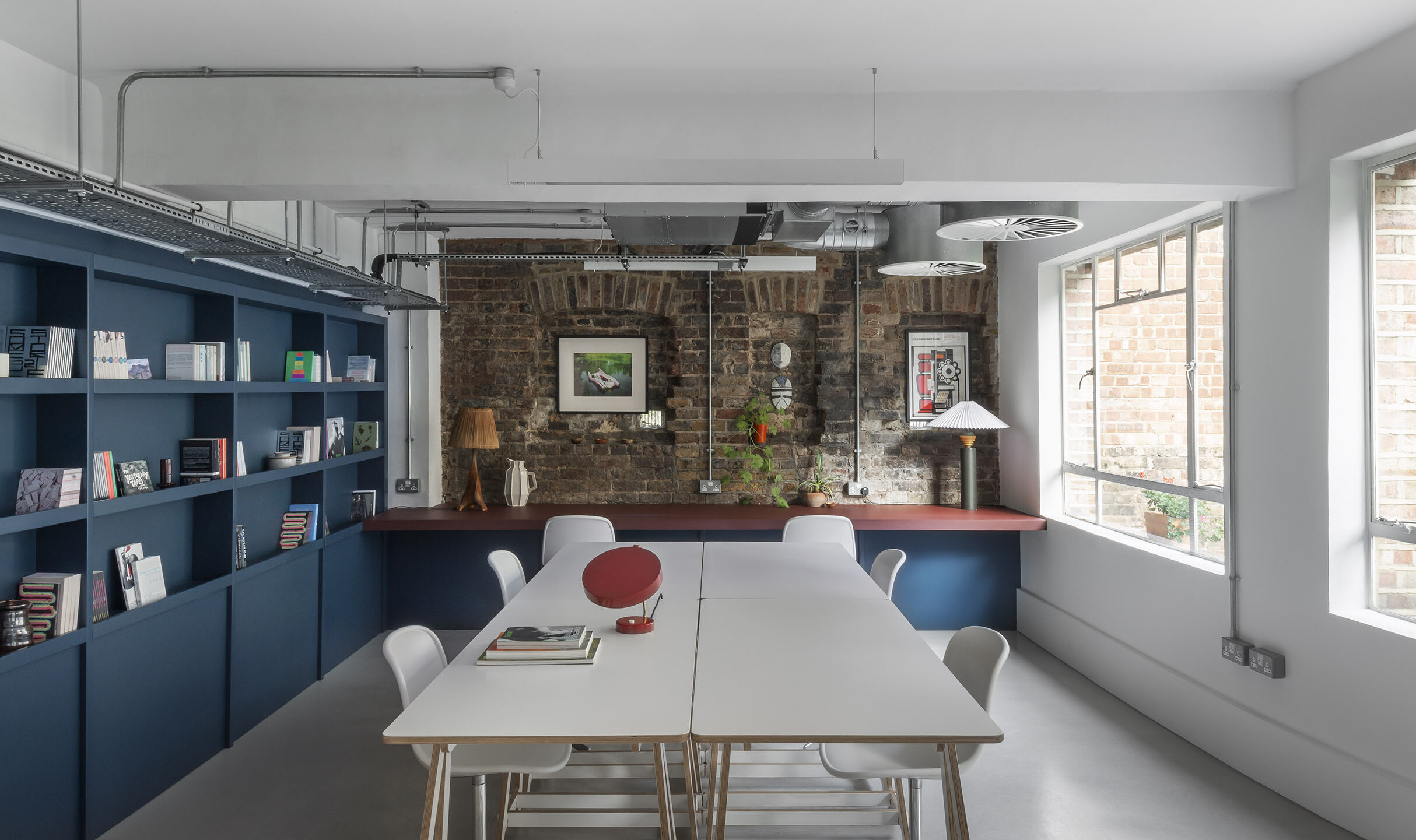
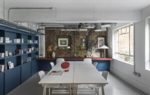
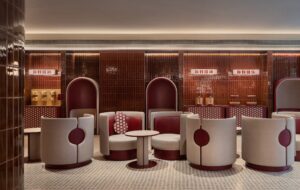
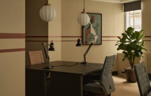
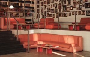
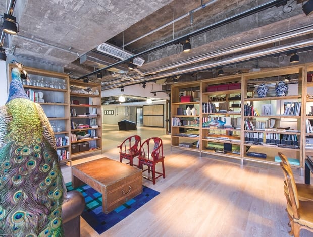
 Merchandising props, including two peacocks, pop up throughout the interiors|The ‘press cage’, a blank space used for media launches across all brands|Warm timber and colourful accessories temper the hard industrial shell|A jungle of indoor plants in the breakout space|Shared spaces feature vintage furniture from all over the world|Desking areas are more conventional – but staff are encouraged to customise||
CL3 has designed an open-plan space filled with vintage furnishings for retail giant Lane Crawford.
A sarcastic riposte to the cliche “My school days were the happiest time of my life,” isn’t likely to cut much ice at the new, seven-storey HQ of The Lane Crawford Joyce Group, one of Asia’s leading fashion retail and brand management conglomerates.
Jennifer Woo, the 163-year-old company’s chairman and CEO, who had a huge input into the HQ’s design, appears to see school life in a very positive light: “She compares the office to a school, which is an interesting way of looking at the space, with ‘classrooms’ and breakout areas where people can relax, interact and better communicate with each other,” says Sue Loughry, the HQ’s project director, and a member of the team of in-house creatives who co-designed it. “At the project’s conceptual stage, inspirations such as humble school environments, creativity and unconventionality were often quoted.”
Home to around 900 employees, the head office occupies a new-build office block called One Island South on Hong Kong Island. Inside, it’s predominantly open plan, and a company press release stresses the symbolic significance of this: “The new HQ’s aim was to break down physical barriers… A fluid, democratic, open-plan environment was created to facilitate communication and collaboration.” Lane Crawford commissioned Hong-Kong-based architecture firm, CL3, to implement their ideas.
Arguably, many associate school life with conformity and a rigid hierarchy rather than unconventional behaviour and an egalitarian culture – not that the company’s upbeat rationale about its HQ acknowledges this.
Self-conscious scholastic references abound in the office, which, distributed over seven upper floors of the 31-storey high-rise, is occupied by the group’s four subsidiaries: luxury department store Lane Crawford, fashion boutique Joyce, footwear, bags and accessories specialist Pedder Group and retail, management and distribution arm ImagineX Group. On the 29th floor – a communal area for all companies – are US high-school-style lockers (for staff to store personal belongings) and an eating area that incorporates a table-tennis and snooker table and second-hand school furniture.
“We wanted warmth and a less mechanical environment than in our previous offices”
Still, the trumpeting of these collegiate references shouldn’t detract from the fact that the office doesn’t feel institutional but looks like a fun place to work, especially for young, design-conscious staff who surely get a buzz out of being in a hip and, yes, luxurious environment rather than an aesthetically pedestrian office.
Workspaces aside, the HQ is heavily leisure-orientated: it has a wellness room offering massages and yoga, Pilates and tai chi classes, a gym, a Nintendo Wii system and vintage vaulting horses, a bar and a vast breakout space with plumply upholstered armchairs. In the ImagineX office is a recreation of a garden, with 1970s-conservatory-style rattan furniture and potted plants that staff are encouraged to take to their workspaces and grow. And the corners of every floor is a designated breakout space, while floor-to-ceiling windows afford sweeping views of the South China Sea, ensuring the office doesn’t feel claustrophobic. Moreover, with wi-fi available throughout, employees can roam and interact freely.
And while Woo clearly romanticises school life, the company’s fetishisation of reclaimed school furniture is part of its broader predilection for voguish vintage, early 20th-century furnishings as a whole: the group’s in-house design team, made up of creative directors and heads of visual merchandising, trawled Parisian and London flea markets, snaffling such old-world yet robustly utilitarian items as Thonet bentwood chairs from a French bistro, 1930s library stepladders and a 1930s coat rail from a British Rail station. Another quaint touch are the phone booths resembling classic British phone boxes, where staff can make private calls.
The personal taste of Ross Urwin, creative director of Lane Crawford Home and Lifestyle, and formerly buying manager at London department store Liberty, has clearly been a major driving force behind the office’s aesthetic: “I visited many antique markets and auctions and chose quirky antiques,” he says. “I sourced a number of industrial Singer sewing machine swivel stools, and two 1920s fairground gambling tables are hung as art in one breakout room.”
“One big challenge for us was ensuring that contractors understood the spirit of raw finishes and stopped making things look too finished”
‘Industrial’ is a telling word here. Indeed, it aptly describes the office’s stripped-down architectural aesthetic of concrete floors and exposed ceiling ducts. “When designing the space, references were constantly made to warehouses in New York and Europe, veering away from the standard palettes common in commercial fit outs,” says Loughry. “We wanted warmth and a less mechanical environment than our previous offices, where younger team members would feel more comfortable. One big challenge for us was ensuring that contractors understood the spirit of raw finishes and stopped making things look too finished.”
The boardroom even boasts a 7.5m-long table made of scrap wood, designed by Dutch upcycling star Piet Hein Eek. Elsewhere there are artist Mike Stilkey’s idiosyncratic paintings on recycled, stacked books. Near the main reception is what’s been dubbed the ‘press cage’. Contained within the kind of concertinaed metal gates that normally enclose lift shafts, this area is used to hold press events.
The overall insistence in this office on raw textures chimes with its location – Wong Chuk Hang, an industrial district that’s fast becoming a trendy area. It’s slightly contradictory that while the office’s industrial aesthetic is homogeneous and neutral in colour, employees are encouraged to customise it with visual merchandising props and artworks once used to decorate the company’s 500 or so retail outlets. Some are gloriously flamboyant: two taxidermy peacocks adorn a library stocked with fashion and design books, while parasols with Japanese kimono prints dangle decoratively from one ceiling.
The entire scheme might be inspired by classrooms but – mercifully – not as most of us remember them.

