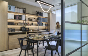
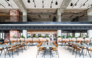
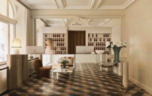
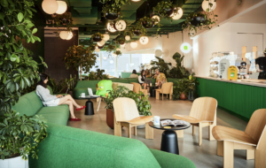
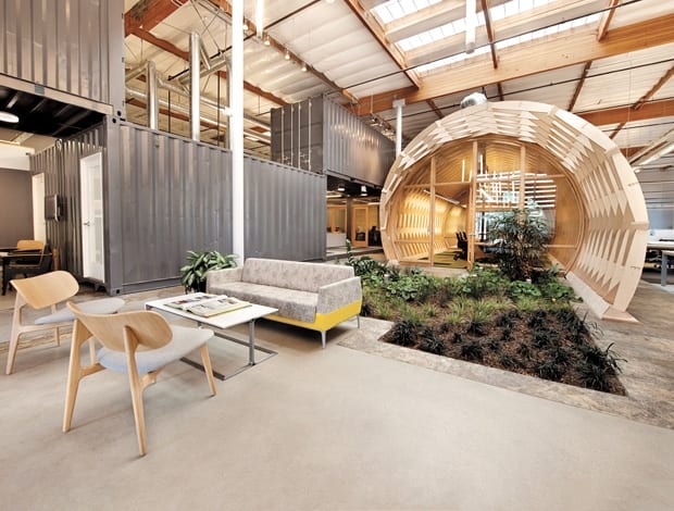
 $1,000 shipping-containers turned into offices in an LA warehouse|Inside the tunnel; each end is glazed, so it feels more boardroom than bunker|The kitchen area, with flashes of corporate yellow|Timber and plants soften hard edges|A cubicle-free layout, unusual for the US||
Cunningham Group used inexpensive materials in creative ways, giving its LA office a design edge on a slim budget.
Once a down-and-out industrial ghost town, the Hayden Tract in Culver City, Los Angeles, has been in a state of perpetual transformation since 1988, at the behest of big-thinking developers and one radical architectural visionary.
The area was originally built in the 1930s to service nearby railway sidings, creating a local landscape of single-storey warehouses, which were mostly abandoned.
Then came Frederick and Laurie Samitaur-Smith, who worked with architect Eric Owen Moss to initiate the Conjunctive Points project, a collection of buildings – some sculptural, some sharply contemporary, some just crazy – all within a few blocks of one another, single-handedly creating a jaw-dropping new neighbourhood. Needless to say, creative types arrived in their droves, and the area is now home to the offices of movie studios, designers and advertising agencies, which is where we find Cuningham Group architecture.
Back in 2008, the firm bought the warehouse it now occupies with plans to build a five-storey, LEED Platinum office and rent it out. Then recession hit, the plans took a back seat, and in 2011 the practice realised the rental income wasn’t matching the building repayments. So a new plan was hatched: to move its own LA office, previously in nearby Marina del Rey, into the warehouse.
Not only did this save money, it gave the firm a chance to design a more personalised environment. “Our workplace needed to reflect our culture and the way we work, and the old office just didn’t,” says Jonathan Watts, principal at Cuningham and director of design and brand, who led the project design together with colleagues Jack Feichtner and Amelia Doyle-Feichtner. “It was a great opportunity to design ourselves a space we were proud of and could enjoy being in.”
“You see a lot of corporate layouts where, at the entrance, you can’t see anybody actually working”
Starting with just a shell, first on the agenda was walling off a third of the warehouse in order to rent out space the firm didn’t need (its current tenant is Sony). In the remaining 1,100sq m, huge windows were cut out and two skylights were added in the roof, to bring natural light into the centre of the expansive floor plate.
Underneath these roof lights is a latticed timber archway – or lamella roof if you want to get technical – which is the epicentre of the office and houses the office’s two meeting rooms. It has been made private by blocking in the diamond-shaped gaps between the tunnel’s interlocking beams, but the end walls are glazed to introduce some transparency, something that was important to its congruency with the rest of the space as well as the firm’s ethos.
“In the other office, we had conference rooms that were off to the side or down a corridor,” says Watts. “You see a lot of corporate layouts where, at the entrance, you can’t see anybody actually working. Whereas here, our people meet the clients, and we don’t keep clients from seeing our messy process.”
Similarly, the banks of desks are all open-plan with low divides, so all 48 employees can see everywhere in the office from the comfort of their seats. This means communication flows easily, information is shared and younger staff members can learn by osmosis. It also physically supports the firm’s horizontal management structure.
“It was a great opportunity to design ourselves a space we were proud of and could enjoy being in”
Watts admits this is unusual in a country where offices generally tend to cling to their cubicles. “It’s a very conservative society. They value privacy and secrecy in a corporate setting, whereas Europe is starting to see the value of openness. We Think by Charles Leadbeater is a brilliant book that helped me understand the value of sharing ideas and intellectual property, which is something we’ve taken on board.”
Given the office’s open layout, the team wanted to create a space that would help advertise the firm’s identity to visiting clients visit. “We wanted something that epitomises who we are,” says Watts. “When clients come in, they see the garden and the lamella, so the first impression is of greenery, wood and low-tech-but-interesting structural materials.”
Remnants of the building’s industrial history are fused with warmer, more homely materials and splashes of the brand’s bright yellow to keep a balance between cool and cosy. Concrete floors remain, but with added sections of carpet to demarcate work and meet areas. An exposed ceiling, strip lights hanging from steel wire and slim structural pillars tie the scheme to its warehouse roots, while a small indoor garden and the use of wood take the edge off some of the cold and hard materials.
The most industrial additions are the shipping containers, bought for $1,000-a-pop down at the docks, and used as private offices at the moment, with plans to install a ping-pong table and Martini bar. These divide the main office from the back-of-house area, which features a model-making studio, library, layout area, storage and facility space and a bicycle repair workshop.
Working with a tight $1.4m budget – which had to cover a new electric system, all the structural work, a seismic retrofit and new roof – much of the scheme was borne out of necessity, using simple, cheap materials in an interesting way.
Huge costs were also saved by having completely natural ventilation, which means no air conditioning. In California. How? Well, long story short, the cooler air comes in via low windows on the north side while hot air is sucked out by fans on the south side roof, so the office benefits from 100% fresh natural air and mostly natural light. The result is a 35% energy saving on the old office, which was bigger, and an expected LEED Gold rating. More importantly, according to Watts, it has made a big difference to the employees’ activity, creativity and morale.
Spurred on by this project, next up is Cuningham’s Minneapolis HQ, an adaptive re-use of a four-storey, timber frame mattress factory building built in the 1890s. Sounds like another outside-the-box interior is on the cards. “There’s nothing wrong with a big shiny office building if that’s what you want your clients to see you as,” says Watts, “but this is more us.”

