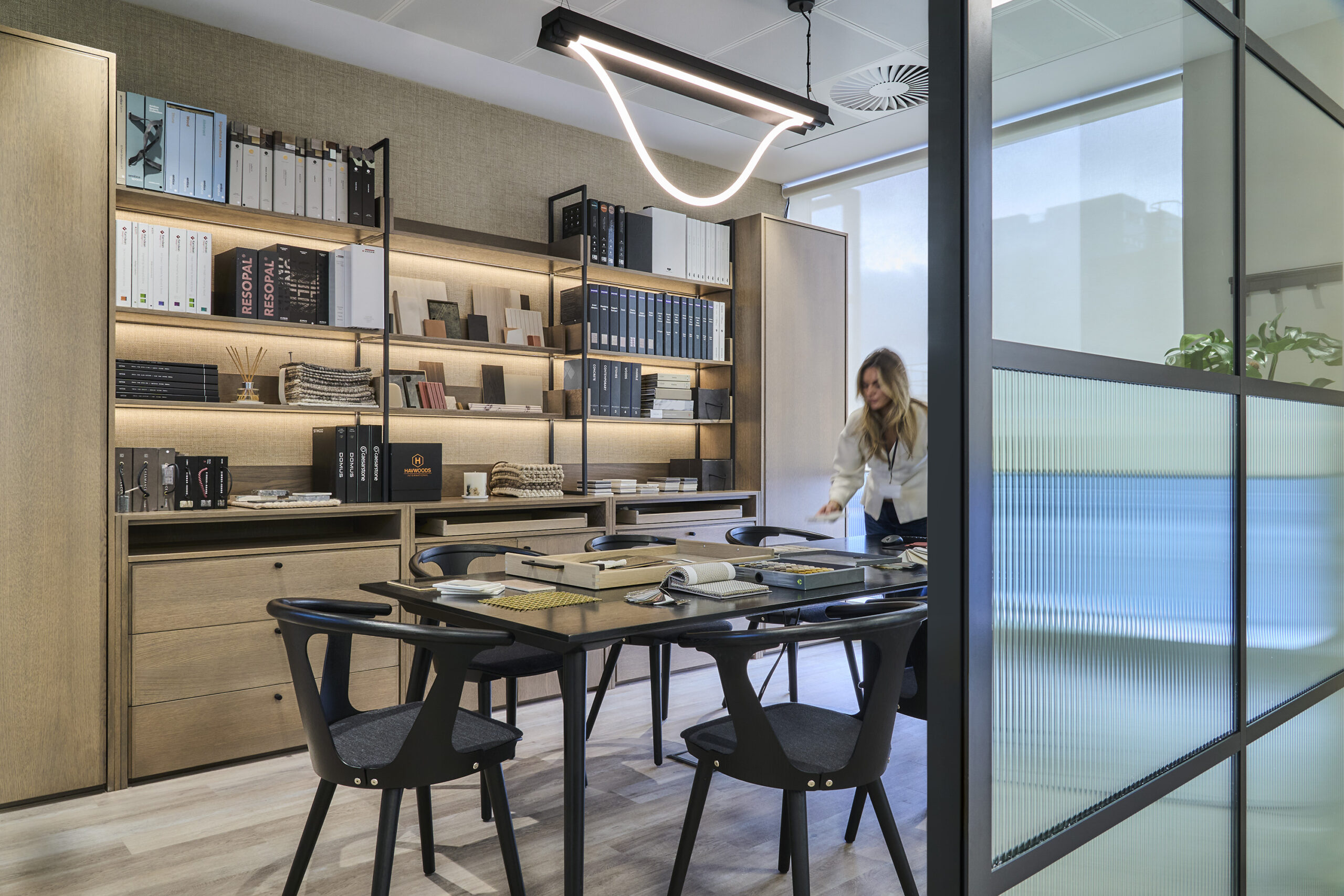
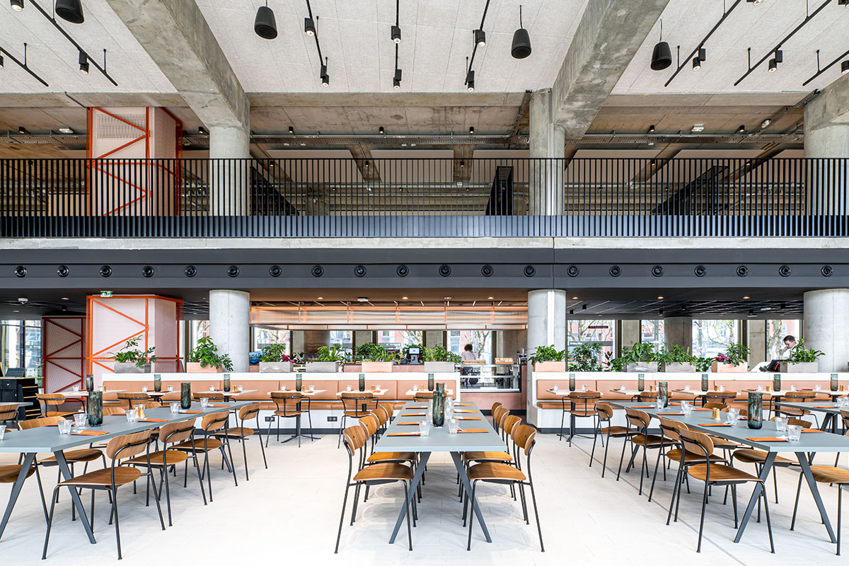
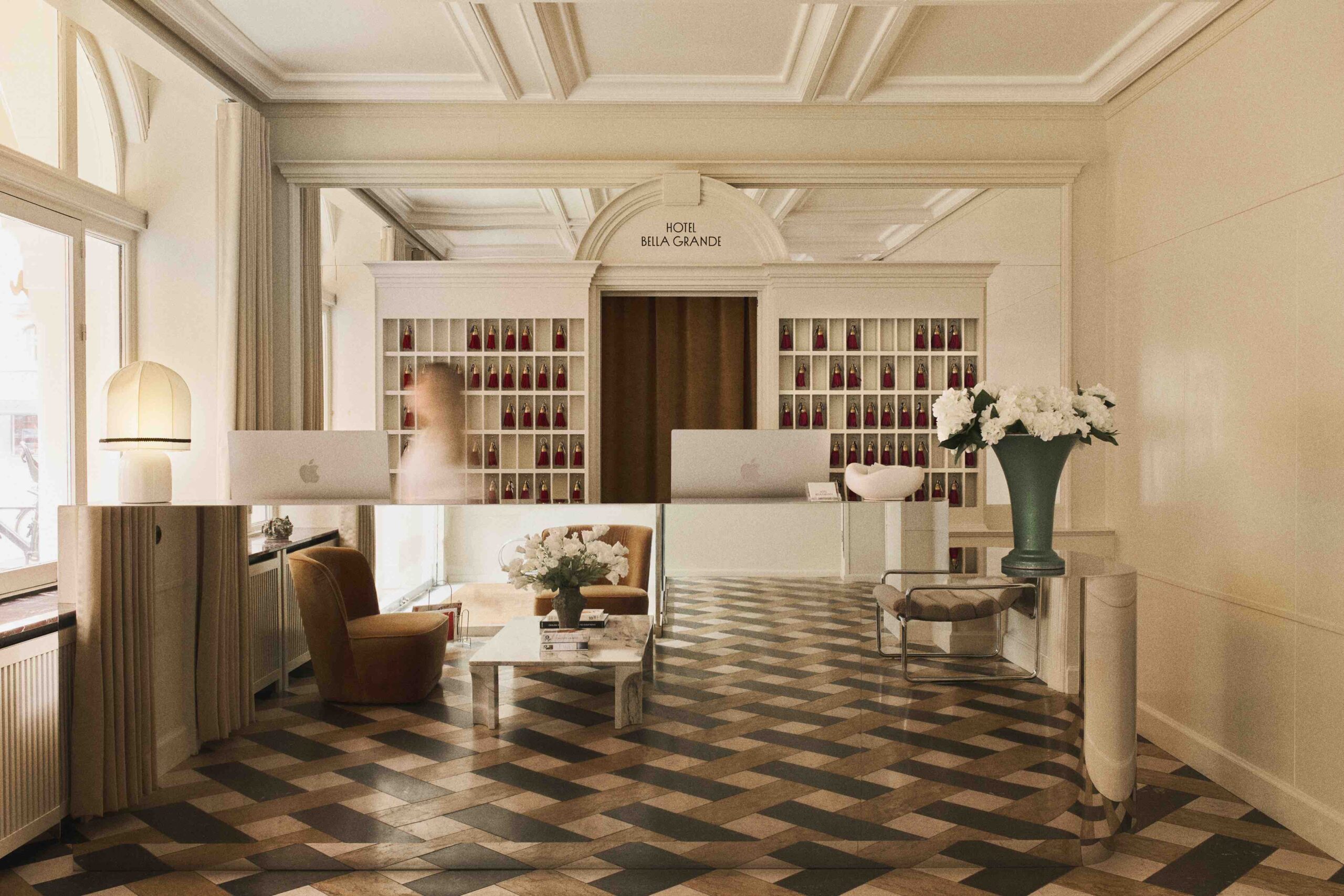
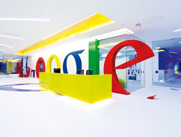
 The main reception makes a huge impact compared with other companies in the building (and there’s no forgetting where you work)|Architect Scott Brownrigg has squeezed in plenty of communal space as well as individual workstations|A short lease means that Google has spent more lightly on finishes but invested in quality, portable furniture|Two of the beach hut meeting rooms, with Arper’s Catifa 80 chairs and Dizzie coffee table|The fun never stops: video pods are housed inside giant illuminated dice|Bene supplied the workstation desks, while the flooring throughout was provided by InterfaceFLOR|The London to Brighton theme (red phone boxes and beach huts) in full throttle, with furniture from Naughtone, Hitch Mylius and Vitra|Small meeting rooms approached through the Google logo’s giant “o”s||
It has been estimated that Google processes a billion search requests each day, so it’s reasonable to expect the company’s offices to offer something over-the-top and spectacular. Workplace design was undoubtedly turned on its head when the now-infamous Googleplex Zurich opened in 2008 complete with slides, firefighters’ poles and igloo meeting pods – all features meant to represent the company’s unconventional approach to business. Critics have since scoffed at the “playpen” quality of the Zurich scheme, or at least questioned the possibility of staff being distracted by so many colourful beanbags and aquariums filled with tropical fish. But the space sent a strong message about the company’s policy of investing in its employees. As Google offices have continued to pop up around the globe, the message has remained consistent. It’s about attracting and retaining the very best people by giving them bright, inspirational spaces as well as plenty of freedom and a lot of perks.
The newest London office is a good example. At 123 Buckingham Palace Road, the space is intended to be an overspill for the company’s main UK hub a short distance away. The third level, a square floorplate situated around a central glass atrium, has been fitted out for 320 people by interior design firm Scott Brownrigg with a mix of open-plan office space, heaps of flexible work/breakout areas, cellular offices, meeting rooms of various sizes, an “Asian-fusion” restaurant providing free breakfast and lunch, a games area and spa, including massage facilities(!) and a fully equipped gym. They have packed quite a lot into the floor plan, needless to say. What stands out here is that most offices with this amount of flexible space would have a good portion of their staff sharing desks, but Google insisted that each person have their own desk as well as having all of the collaborative work zones. It’s an interesting philosophy considering the company’s technology could probably allow it to forgo the idea of an office altogether – let alone the idea of individual workstations. The result is an office with a luxurious approach to space, with lots of work options and more than a few empty desks.
As for aesthetics, all of the above has been done in a “Brighton-London” theme, although it’s a bit more Brighton than London, it must be said. There are a few red phone boxes on the floor but the eye is drawn to the timber “beach hut” meeting rooms for two or three people, which sit alongside a bed of seagrass and pebbles and atop shaggy beige carpet meant to mimic sand. Themed graphics in the main work areas (mopeds, ice-cream cones, Brighton rock etc) are punctuated by bursts of red in the light fixtures and furniture, which is all very nice.
It’s worth acknowledging, though, that Google’s tendency to theme its offices is a mixed blessing: it gives interior architects a strong thread for the design, yet there is the potential cheesiness factor. And that cheesiness factor can’t be ignored when, as in this case, you’re dealing with a serious dosage of primary colour and video conferencing pods in the form of gigantic, glowing dice (Brighton Casino, anyone?). There is a hit-and-miss ratio – some elements are more successful than others. Charming poufs customised to look like liquorice allsorts work really well – the dice and the dodgem car plonked by one of the entrances less so.
Talking to Ken Giannini, head of interiors for Scott Brownrigg, sheds some light on the theme. “It is something very much driven by the client – it relates back to the Victoria train station and how the steam train used to go down to Brighton. It actually gave us an opportunity to hang our hat on something in terms of creativity – there are so many interesting elements that we can pick up on,” he explains.
Interestingly, the strongest visual aspect of the scheme is the reception, which is one of the few areas where the Brighton theme isn’t as obvious. It uses the corporate colours sparingly but boldly by integrating the logo into a construction (mdf with plastic laminate) sitting beyond the customised reception desk. The second “g” of Google swings out onto the white vinyl floor and the two “o”s create doorways leading into small meeting rooms with Brighton graphics and seating covered in striped material reminiscent of a deckchair. All of this is visible from the central atrium as people move up and down the lifts, and it makes a huge impact compared with companies on other floors. Moreover, it really seems to lift the building, which is slightly past its sell-by date.
“A lot of the finishes are not that expensive throughout the whole project. They didn’t need to be,” explains Giannini. “We used a good base of materials in a clever sort of way, keeping in mind that Google have only signed a five-year lease so they didn’t want to spend a huge amount of money. They invested a lot in all the furniture – it is top-of-range because they can take it with them when they leave.” Wherever they do end up in five years, it wouldn’t be surprising if all the current staff move with them as a testament to the care taken to entice them to stay. Giannini agrees: “They see their office environment as one of the key things to encourage the best talent to come and work for them – it’s a really big deal for them in all their offices around the world. All the spaces have the enjoyment factor built in – it’s not just a workspace.”

