By giving the communal areas of the well-known advertising agency a gentle refresh rather than an all-out revamp, design consultancy Holloway Li added a new heart to Mother’s soul
Back in 1966, a small group of determined creatives gathered around a kitchen table in London and hatched the idea of Mother, an unconventionally bold advertising agency that today dreams up playful, edgy campaigns for the likes of Ikea, KFC and Marks & Spencer. Despite Mother’s growth over nearly three decades – locations later sprouted up in New York, Los Angeles, Shanghai and Berlin – the company has never lost sight of its humble roots.
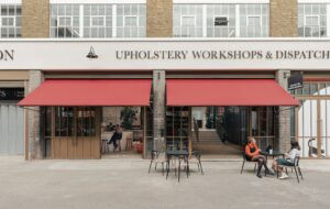
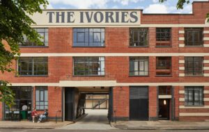
Unbridled independence and imagination are the hallmarks of Mother, and are aptly reflected at its headquarters in London’s Shoreditch neighbourhood. To celebrate Mother’s distinctive spirit, local design practice Holloway Li has gently reimagined the ground floor of the 42,000-square-foot former Lipton tea-packing warehouse, also known as the Biscuit Building, into an enticing shopfront. During the day, it is a refuge for colleagues to eat together and hold informal meetings; in the evenings it often morphs into Downstairs at Mother, a cultural hub engaging the public with music performances, conversations and exhibitions.
“They have such a strong sense of themselves and what they want, and what they wanted was an evolution rather than a revolution,” explains Alex Holloway, Holloway Li’s co-founder and creative director. “It was like holding up a mirror to them and being respectful of what they already had. We didn’t want to come in with a whole different set of rules for them to live by within their shared spaces.”
Helen Sullivan, Mother’s facilities director, appreciates this perspective. “The team at Holloway Li were able to translate our brief seamlessly, understanding the core of our DNA and future vision,” she says. “Their design feels inherently Mother, while at the same time bringing something new and inspiring to the building.”
Mother first settled into the Shoreditch office in 2004, and 20 years later the team still relishes the original design of California-based Clive Wilkinson Architects. An evolving patchwork of upstairs workstations was left untouched, while the worn-out lower level was rejuvenated with contemporary yet subtle interventions.
In recent years, staff had ceased to come down for more than a quick lunch, but the potential for a multi-purpose hangout was clear to Holloway Li. “The furniture was knackered, and there was a dated farmhouse-style kitchen,” recalls Holloway. “We decided to update individual pieces rather than the whole layout, so in a way it became about product design.”
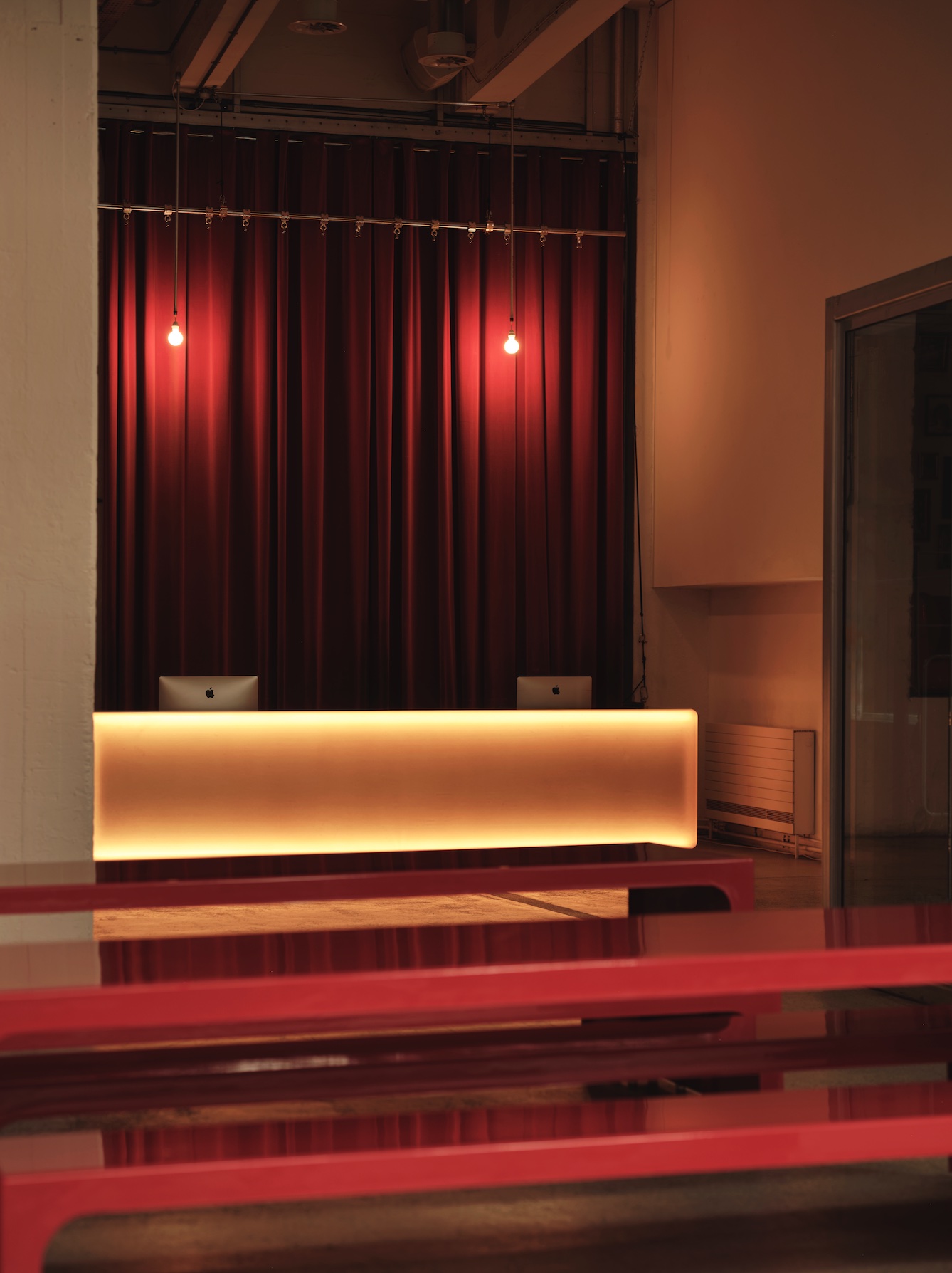
At the entrance, the original stainless-steel reception desk continues to welcome visitors, but Holloway Li reinterpreted it as a striking “beacon of light”. “We added this beautiful, illuminated cloak so that it became an art object,” says Holloway. In a theatrical contrast to the industrial concrete flooring, there is a backdrop of suspended exposed light bulbs and deep red curtains, and the desk conveniently transforms into a podium for events.
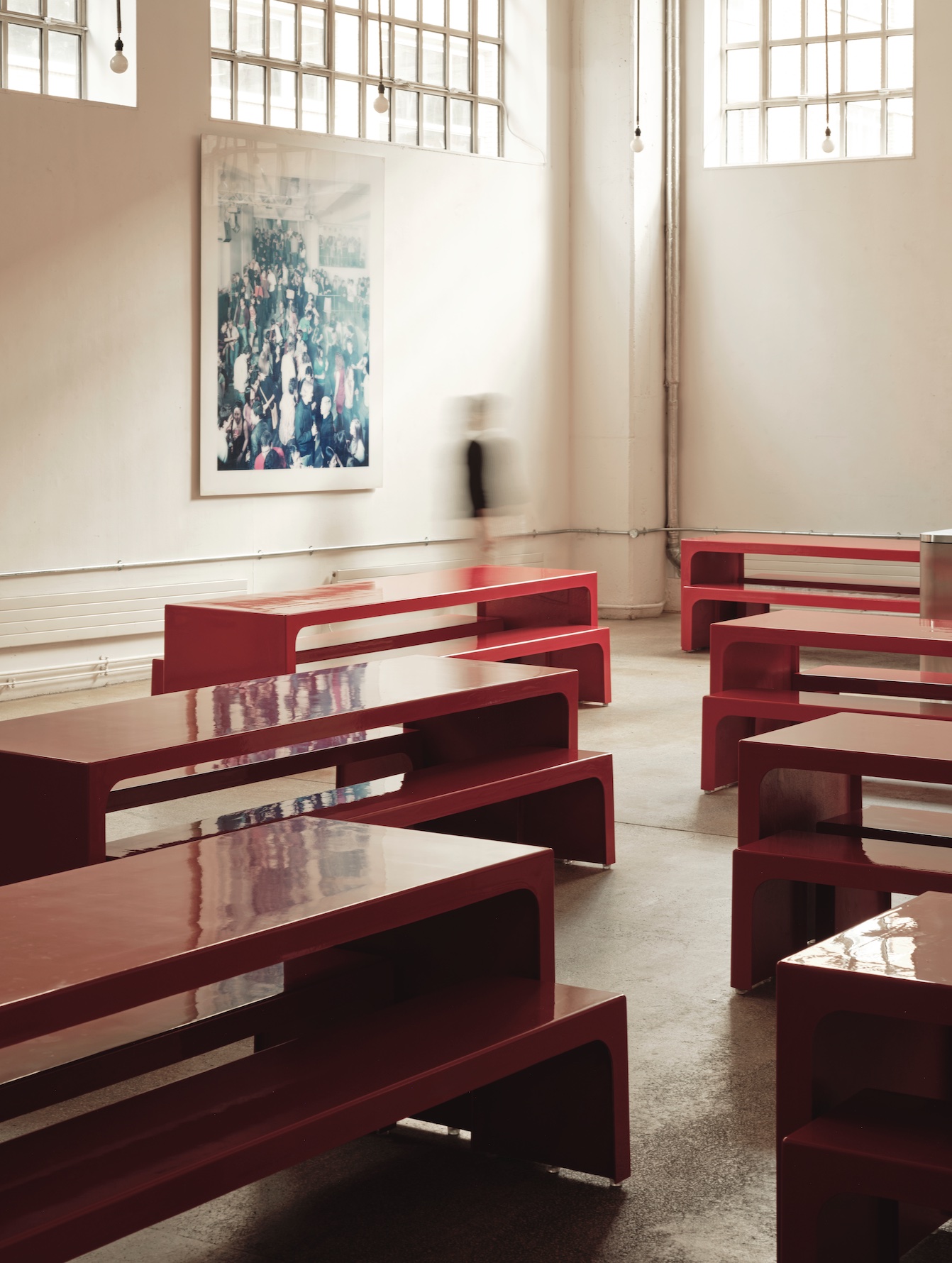
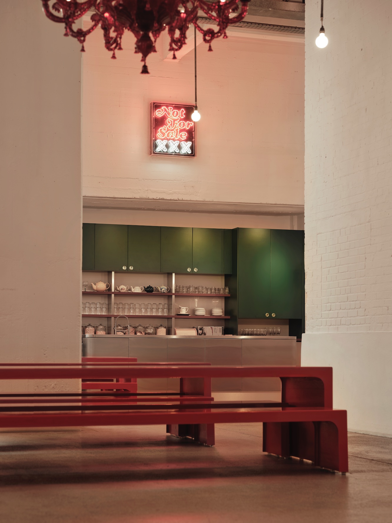
Although they were suitable for meals, the old dining tables were extremely heavy and required the assistance of eight crew members to move, an impractical endeavour considering Downstairs at Mother’s frequent happenings. Removing them, however, made way for the Big Red, Holloway Li’s eye-catching picnic-style tables and benches showcasing a similar silhouette. Crafted from fibreglass and structural foam swathed in lustrous resin, these large, durable, highly portable forms were brought to life by longtime fabrication partner Uma, which took advantage of surfboard technology in their creation.
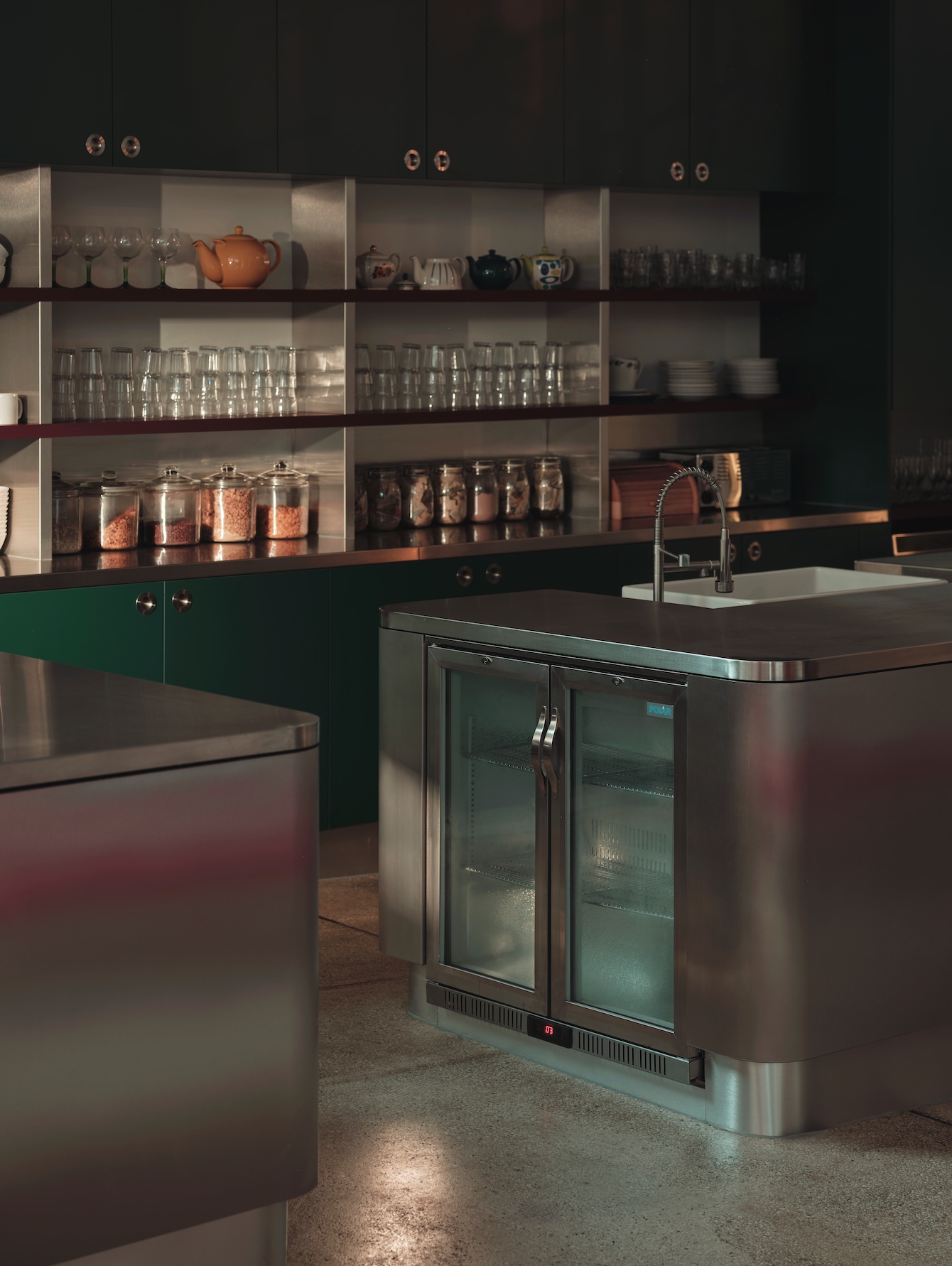
Some 300 people use the kitchen daily, so Holloway Li’s upgrade of the space prioritised functionality and improved flow. Two stainless- steel islands mellowed with curved edges elicit the air of a sleek restaurant, but are balanced with warm splashes of forest green and even more red heightened by homely open shelves lined with vintage tableware.
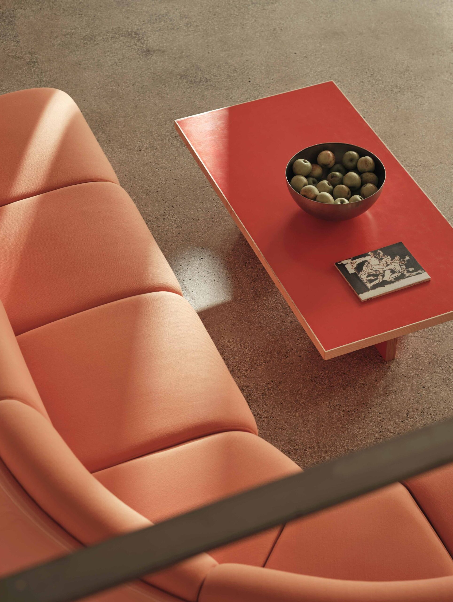
“We acted a little like surgeons, cutting away bits of the existing elements and grafting on new ones to make it seem like not much had changed – but actually, a lot had,” says Holloway. The sustainable mindset that manifests itself throughout the project is best exemplified by the coffee tables, which were constructed from the hefty, run-down benches that once filled the open-plan space. “We didn’t like the idea of chucking everything away. We took the good sections and refurbished them for continuity. There was exactly the right amount of newness based on what was needed,” he adds.
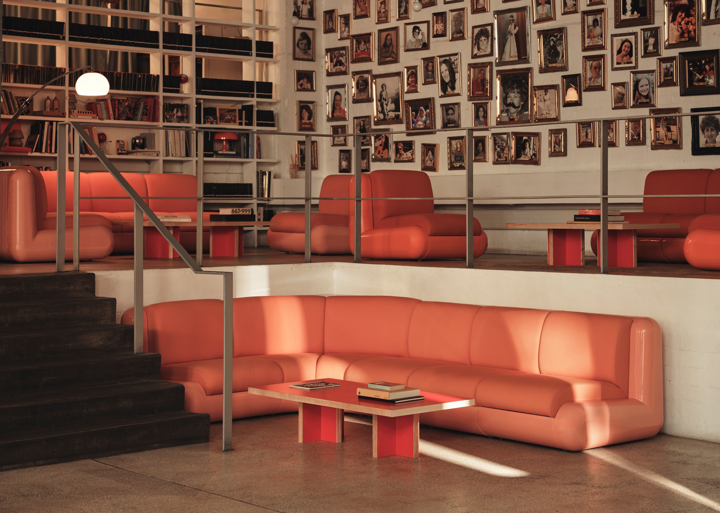
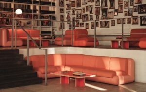
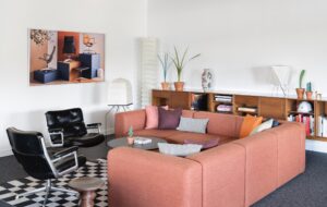
On the mezzanine above, framed portraits of employees’ mothers still grace one of the walls, but the nostalgic assemblage is now complemented by relaxed seating vignettes that revolve around Holloway Li’s candy-hued T4 sofa modules, also manufactured by Uma, in a cohesive alternative to the hodgepodge of vintage furniture that was previously on display.
Unveiled at the 2022 London Design Festival, the design of the T4 – Holloway Li’s inaugural product offering – was informed by “the golden era of the chat-show sofa”, notes Holloway. Given that Mother was founded in part to launch the UK’s Channel 5 in 1997, the array of pink and orange seating not only makes a strong visual impact but celebrates Mother’s origins in the brash era of 1990s Cool Britannia.
Revamping Mother reconfirms Holloway Li’s dedication to telling clients’ stories. “We took a soft, sensitive approach that feels like a true collaboration. It was tailored, it was analytical, but it wasn’t headline-grabbing,” explains Holloway. “The success will be evident in how the space gets used over time.”
Images by Felix Speller
Enjoyed this article? Subscribe to our weekly newsletter here

