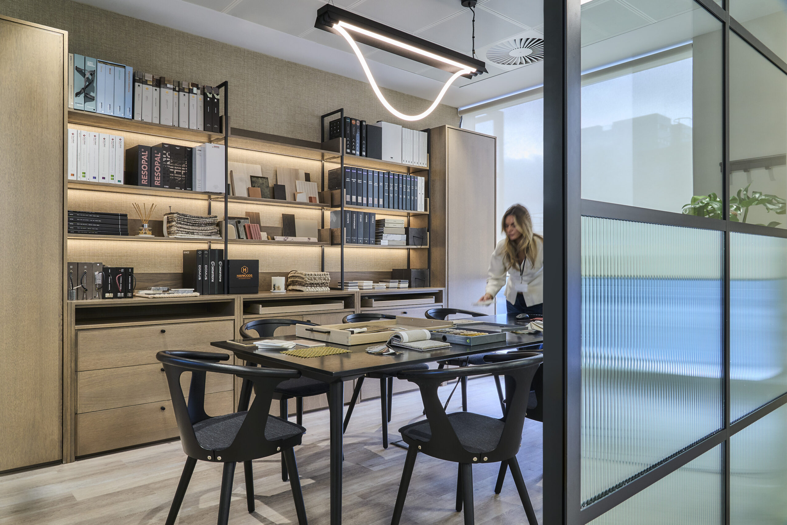
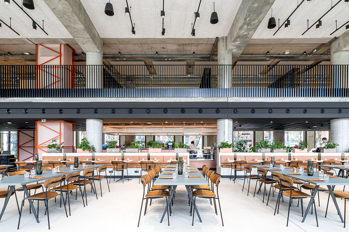
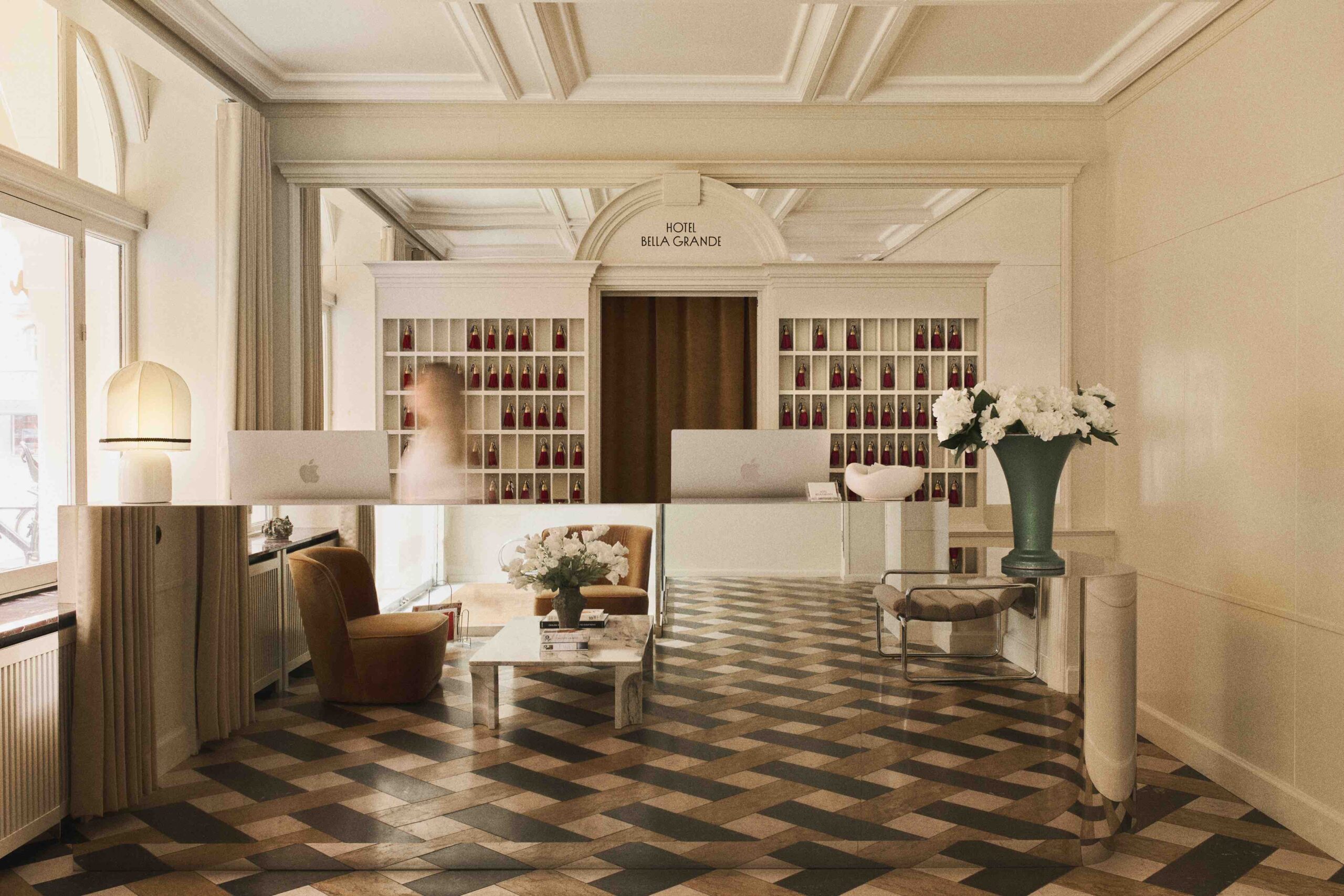
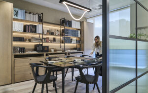
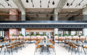
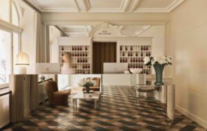
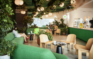
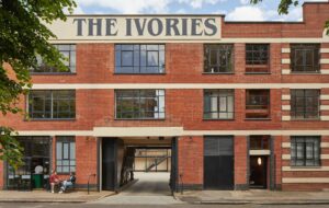
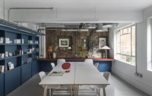
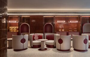
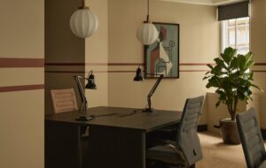
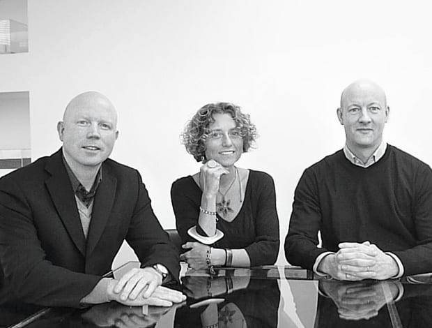
 Paul White, Fiametta Gray and Matt Yeoman of Buckley Gray Yeoman|A slick, minimalist office reception on Grosvenor Street nods to the contemporary gallery frontages of surrounding Mayfair|At the entrance to 33 Charlotte Street, a patterned wall panel adds texture and an air of domesticity|Polished and unpolished concrete mix with ceramic and glass|The entrance to Fred Perry’s HQ has to compete with the surrounding retail-fest in Covent Garden|The brand’s famous laurel motif, fashioned in laser-cut plywood, extends into a reception and seating area||
The stakes are being raised when it comes to front-of-house design. Buckley Gray Yeoman’s directors explain the art of creating a warm reception
Office buildings are not renowned for putting on a front. However slick they may appear on the inside, shabby steps, a tatty facade, a worn-away plaque and a plastic buzzer make a commonplace greeting from the street, setting them apart from alluring retail fronts, restaurants, galleries and hotels. Buckley Gray Yeoman’s (BGY) projects include a wide range of private and public sector, hotel, leisure, and bar schemes, alongside office building and fit-outs.
“We don’t do hospitals,” Paul White chips in usefully: everything else, it seems, is ruled in.There’s not a corporate, commercial division to the practice, which is evident by the variety of their most recent workplace fit outs.
While the facade of their office fit out on Charlotte Street, completed at the end of 2009, is reminiscent of the clean, minimalist design you may find in a Japanese restaurant or hotel, fit to allure the media set that populate this part of ‘Noho’, the front of the Grosvensor Street offices that they completed around the same time borrows from the contemporary gallery fronts that form the fabric of this part of Mayfair.
Finally, the front of Fred Perry’s HQ in Covent Garden, another contemporary project, fits seamlessly into the show of shop windows that make up this heart of retail land.
It’s true that Charlotte Street and Grosvensor Street, both speculative office spaces for the same client, with similar budgets, bear scant resemblance to each other save the ability to emulate their surroundings.
Location is a key consideration when BGY approaches a project, says Fiametta Gray: “There’s no signature style that we apply. Our signature is probably our creative approach to the clients and buildings we work with.”
The entrance to Charlotte Street is a very long and narrow space. A palette of polished and unpolished concrete, ceramic and glass opens up the area while a decorative, patterned back-wall draws the eye. Soft up-lighting adds ambience and a contoured wall, which shields off jutting columns, creates a clean, dynamic space. The space softens as you pass the reception desk, where wood panelling, and a timber staircase lead up to the work floors.
“Simplicity is not always good”
Clear external signage was a key consideration in this project, Matt Yeoman explains. Although the address of the building is 33 Charlotte Street, the actual entrance sits on Rathbone Street, adjacent. The partition separating the office entrance from the neighbouring restaurant’s busy loading bay was also important. “We envisaged a metal structure, but a security consultation with local police gave way to concerns it would conceal crime from CCTV, so we created a very graphic, opaque glass panel, offering clear signage, without secluding crime.”
The project on Grosvenor Street followed suit in that the first priority was to turn a slightly disjointed and confusing reception space into a welcoming entrance.
“Simplicity is not always good,” says White. “It can be banal; our aim was to make a complex space appear simple.”
Everything from the outside steps, canopy and entrance doors received a makeover. The walls inside were knocked out and replaced with a panelled wall, incorporating three separate entrances into the building.
“Before, there were so many doors leading off in different directions it was confounding,” says Yeoman. “The entrance is actually two joined buildings, so a coherent aesthetic was crucial.”
From street level, a line of vision leads through the large glass front into clean, carefully designed, softly lit space, with little to set it apart from the surrounding art gallery windows, which treat entrance space as a visual invitation.
“Mayfair attracts financial clients, but a different kind to the City,” says Yeoman. “The building needed to offer them that difference they are looking for.”
These spaces focused on profiling and emulating the key characteristics and quirks of a location, to create a space people can respond and warm to.
For Fred Perry in Covent Garden, the approach was more tailored, and the requirements more specific. This was a client with a clear idea of what they didn’t want. In the reception, this meant avoiding the traditional reception desk/waiting area format altogether. And without screaming the brand, the firm wanted a front of house space for their HQ that spoke about its core values and rich history.
“Our starting point was the laurel logo,” White explains. “In a way, it’s an elitist approach to the brand, and in a way it’s a discreet one: nowhere in the reception does it say Fred Perry, so you will only know it’s the HQ if you are already familiar with the brand.”
A giant laurel was sculpted from 18mm plywood, and using laser cutting, extended into a seating area and reception desk, making one snaking continuum of the logo profile that retreats from the glass front window. Sculpted by a furniture maker in Cambridge, it took a series of prototypes to demonstrate the concept of morphing furniture and brand to form a centrepiece.
“The installation allowed us to keep the rest of the entrance space a clear white box, with a simple row of mounted black and white photographs depicting Fred Perry, the laurel leaf, the tennis racquet – the starting points of the brand,” says White. This simple décor is complemented with robust wooden floors and industrial steel ceiling panels.
“The office is right there as you come out of the underground station, and with such high visibility it was important to get the visual impact of the window just right,” says White.
Branding for end users is not a new string to the Buckley Gray Yeoman bow: it recently designed the front of house space in Covent Garden’s Long Acre for Channel 5, incorporating plasma screens partly obscured behind glass and a mixture of reflective and back-lit glass panelling.
“We wanted to create an entrance that was a bit more subversive, not a straightforward showcase for the channel,” says Yeoman. It’s a subtle, pared-back approach to branding that sets office design apart from retail space, but as White explains, there are some shared traits.
Fred Perry stores, for example, utilise found objects in their shop displays, making the stores feel like more personalised, less formatted affairs. “With the ceilings in the Fred Perry offices, we inverted the steel panels so they jut outwards; the effect is visually interesting, as well as functional,” says White. “It’s important to avoid the raised floor suspended ceiling formula, even if it means finding more innovative solutions to providing services, to give spaces a more unusual edge.
“Our signature is probably our creative approach to the clients and buildings we work with”
“It was actually peeling back layers of this building, and discovering features that had been overlooked in past fit outs, that made this job so interesting.”
From the prolific project count – Buckley Gray Yeoman began 2010 with the completion of their 700th project to date (they were established 13 years ago) – the modest head count (circa 20 youngish employees) and the calm demeanour that presides over the practice (on the fourth floor of The Tea Building, overlooking east London) you can only deduct this is a hard-working but cool and collected outfit that places high premium on innovation.
The practice recently designed a chain of affordable serviced apartments for business/leisure in many international and European hotspots, and are also pioneering industrial work in the field of waste-to-energy units. Getting the job done may be what makes for the impressive figures, but it seems to be that staying fashionably different is what makes Buckley Gray Yeoman count.

