Hawkins\Brown design Clockwise Mountbatten House taking inspiration for the shared workspace from Southampton’s rich marine and Regency architecture heritage
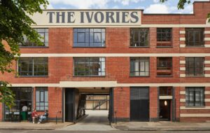
To answer the changing needs of today’s work force, developer Castleforge tasked architecture firm Hawkins\Brown with creating shared workspace Clockwise Southampton in Mountbatten House, a conventional 1990s office building in the centre of Southampton.
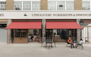
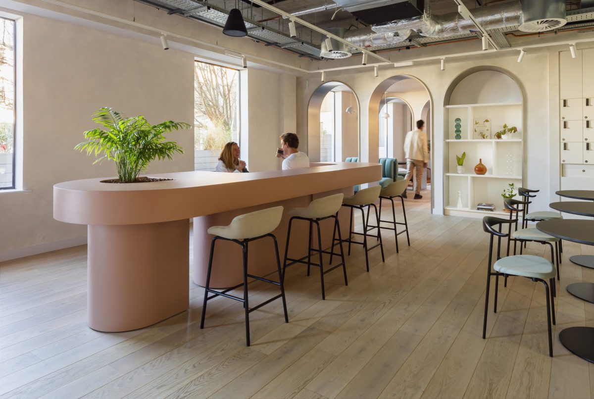
The architects worked on the ground, first and fourth floors of the five-storey building, adding a new terrace and café, as well as a new exterior canopy at the entrance to create a striking presence in the centre of the city.
“The aim was to combine traditional office space with fully fitted, flexible co-working spaces, and bring big companies and small innovative businesses into the same building,” explains Massimo Tepedino, partner at Hawkins\Brown. “Plus, the new shared amenities foster socialisation and collaboration, and users can meet and work together in a way they wouldn’t be able to do when working from home.”
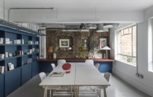
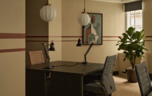
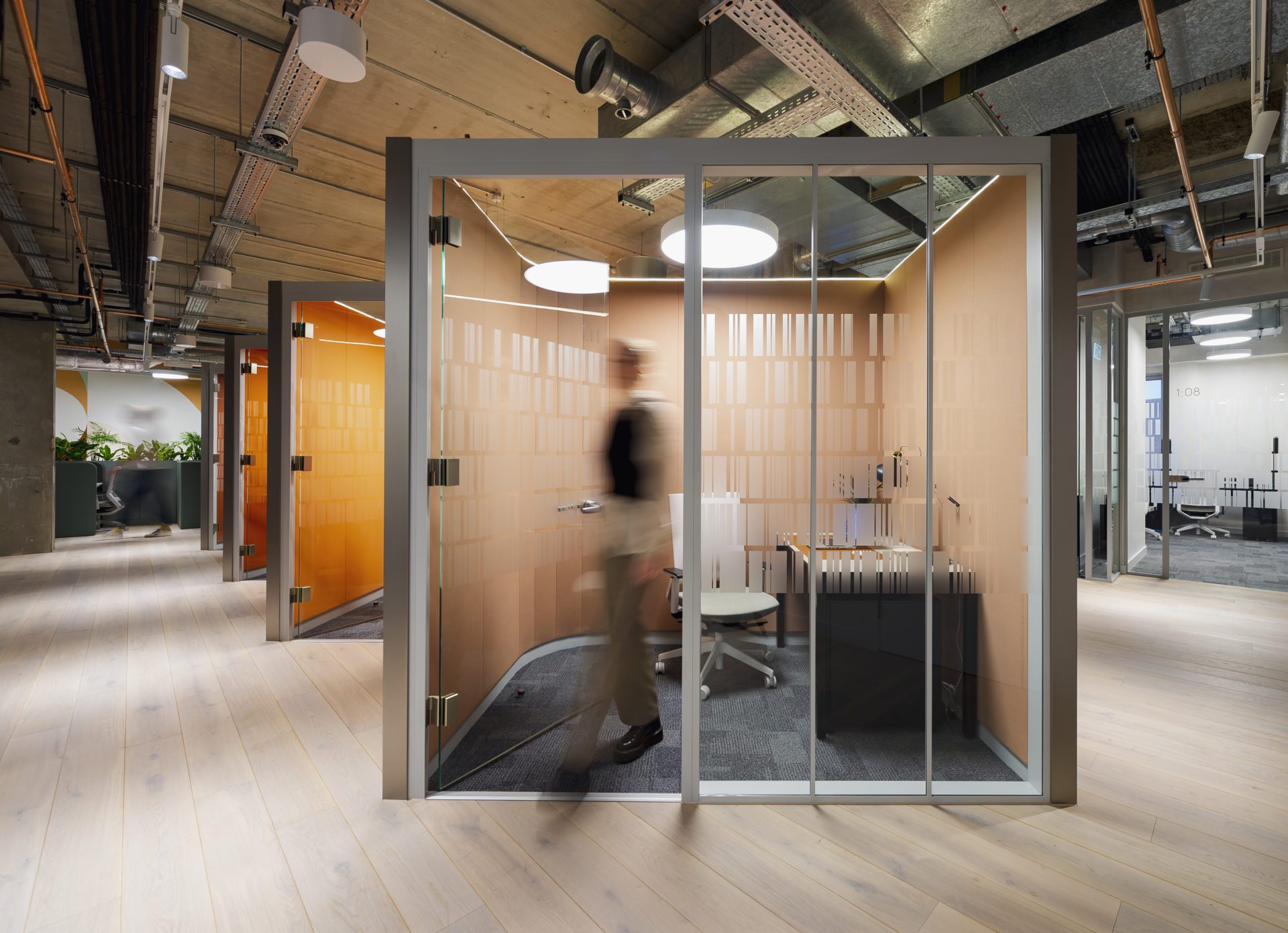
The new interiors include a variety of different workspaces, ranging from typical private offices to more experimental, steel-clad single office pods and combined desk-planter units. There are also zoom rooms with adjustable lighting for video calls.
“The pandemic has created a whole new set of requirements: increased amenity and social spaces, access to outdoor spaces, natural ventilation, a focus on hygiene and maintenance, frictionless bike store and changing facilities,” says Tepedino.
“These spaces don’t produce any direct revenue, so finding the right balance between achieving maximum lettable spaces and providing a better user experience was exciting and challenging.”
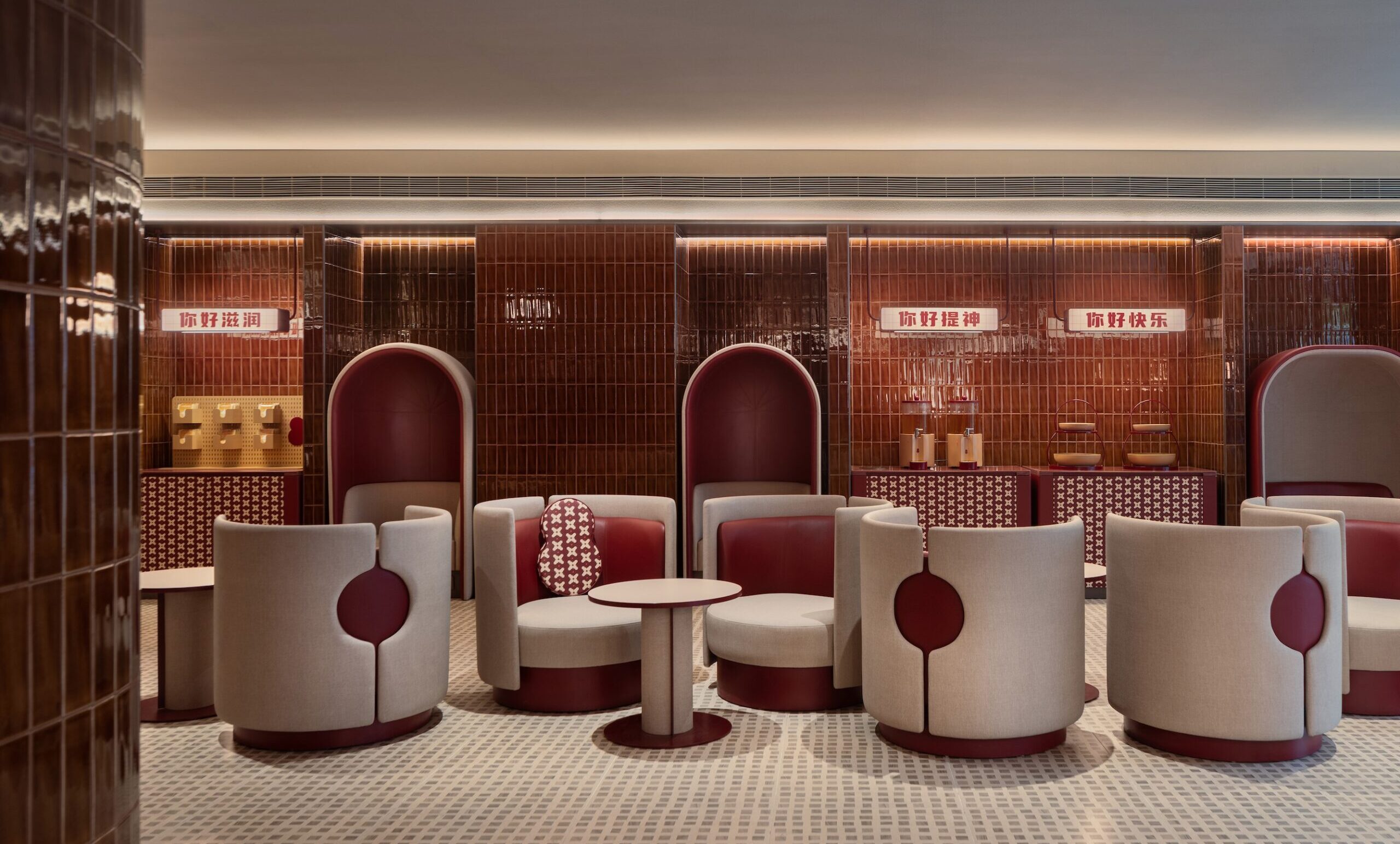
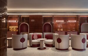
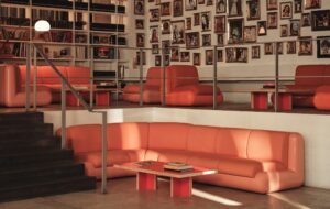
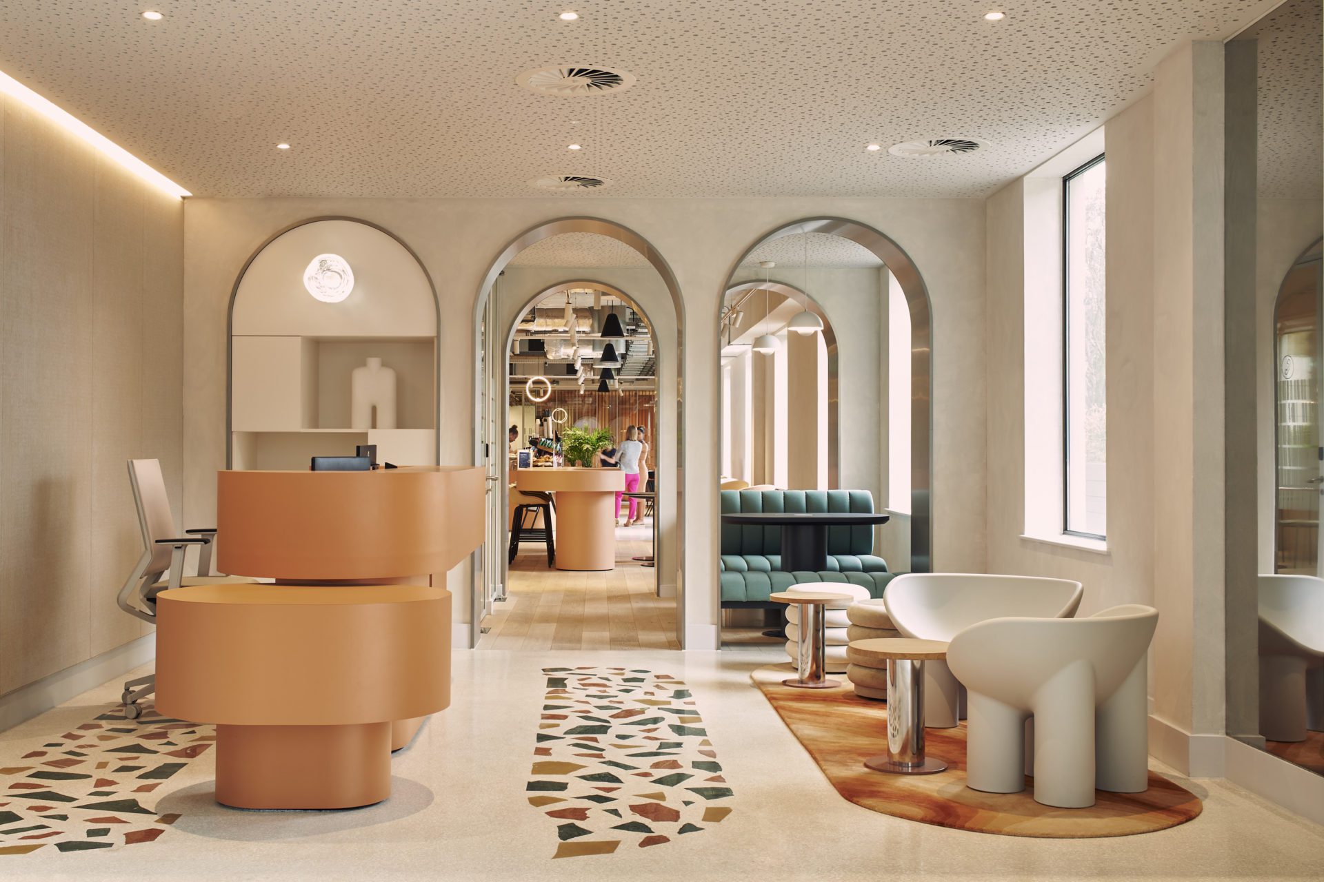
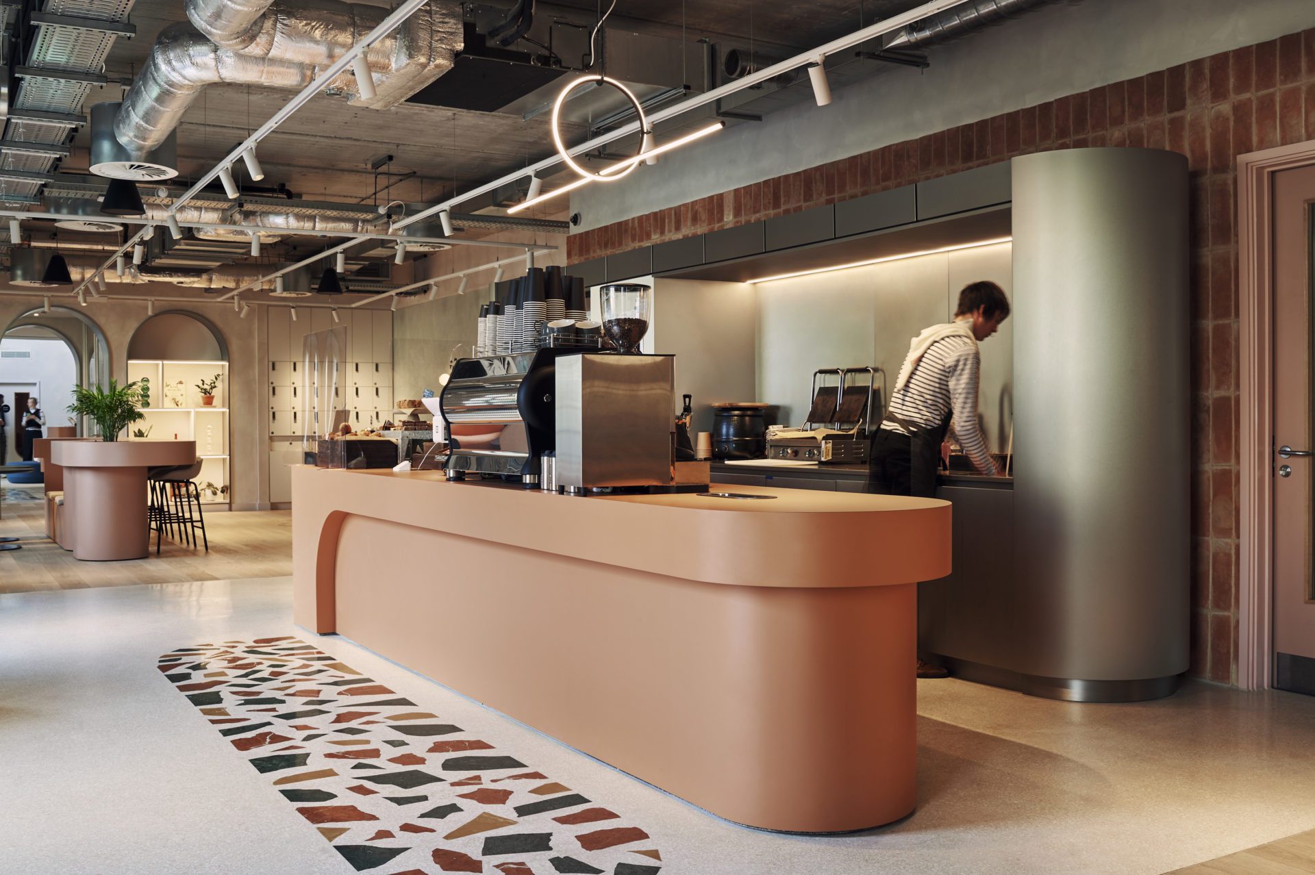
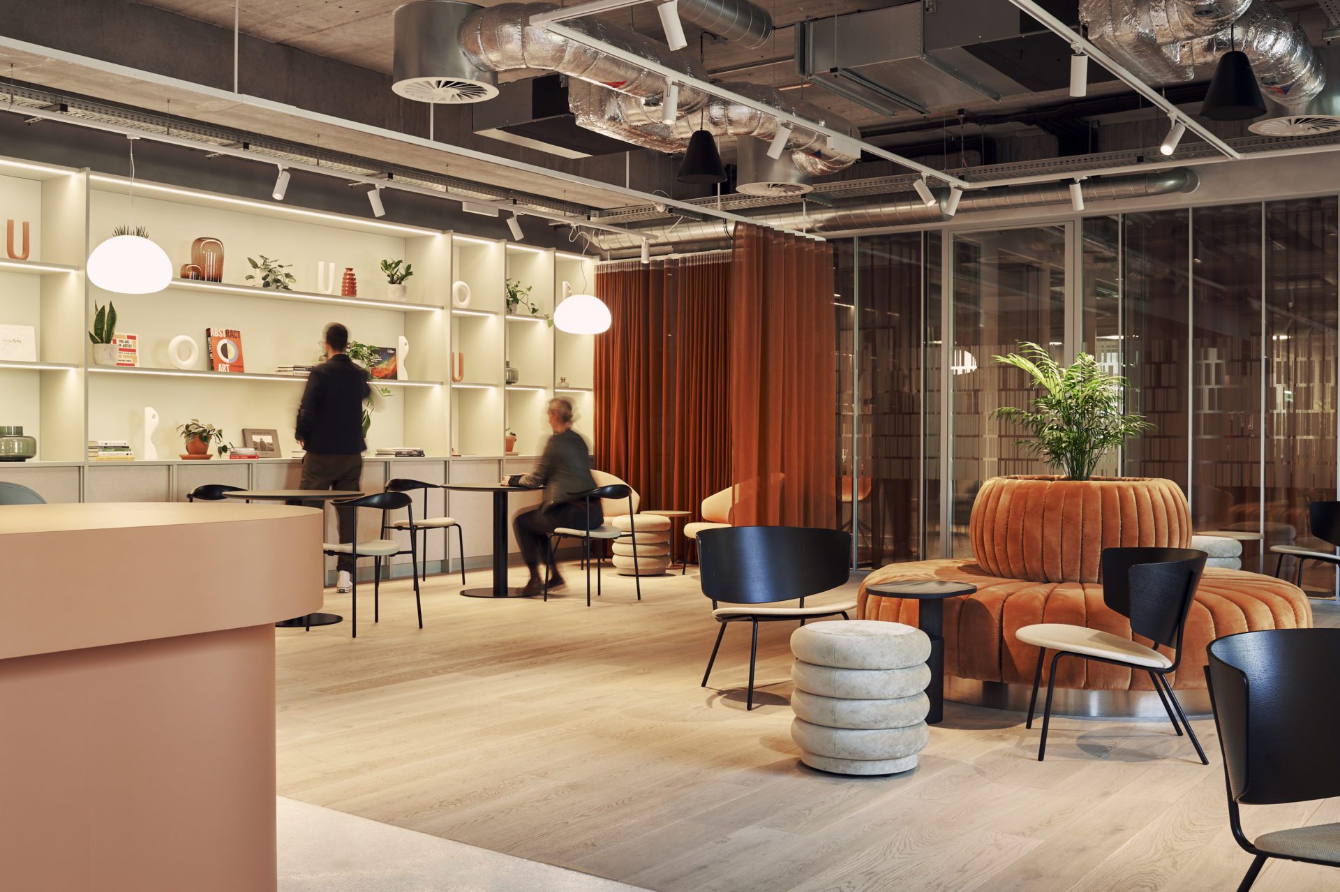
Keen to ensure that users feel welcome and comfortable, the new interiors have smooth, curved finishes, simple shapes and organic colours. Curved joinery is dotted throughout the social spaces to create visual landmarks and define certain zones, while also drawing on Southampton’s marine heritage and surrounding Regency architecture to root the building in the historical context of the city.
“We wanted to develop a narrative that links it to Southampton. When we first visited the building, we were struck by how the area had lost its connection with the seaside – it could have been anywhere in the UK,” explains Tepedino. “Our intention was to subtly introduce some of the colours, textures and shapes of Southampton’s seaside location into the scheme.
“We looked at rich tones and natural colours and textures, and juxtaposed smooth and rough materials to reference the rich palette found in the marine environment. We introduced terrazzo, with its random pattern of various aggregates, to reference sand; textured clay bricks nodding to eroded rocks; and stainless steel to evoke the reflective surface of the sea.”
Images by Ruth Ward
Enjoyed this article? Read more: Part of London’s Design District, Bureau offers a new – and affordable – way for creatives to connect

