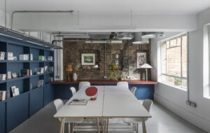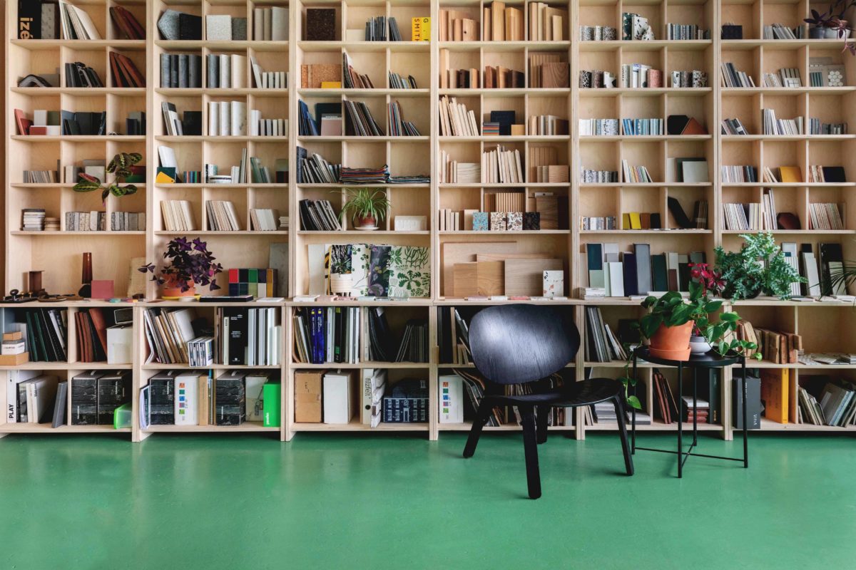
Statement storage, a feature floor, pops of colour and plenty of plants. With a few well-considered components, Emil Eve Architects have turned their shared studio into an inspiring workspace that offers a fresh, uncomplicated setting to welcome clients
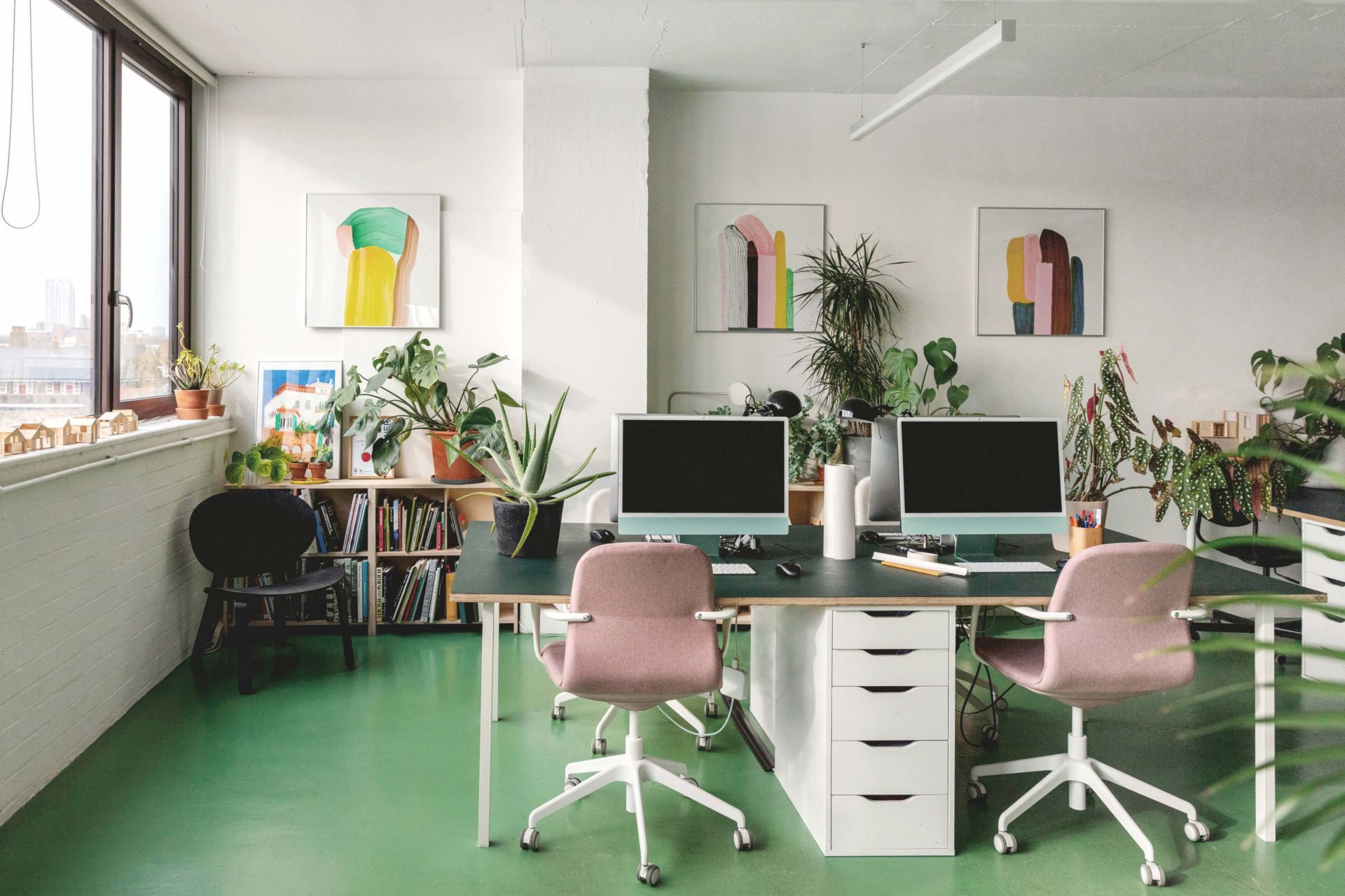
Visiting the stylish office of Emil Eve Architects in Hackney, East London, you are immediately struck by the floor. It is an eye-catching colour – a wall-to-wall, can’t-quite-put-your-finger-on-it shade of green. The optically ambiguous shade hovers between looking more yellowish or more blueish depending on how the light hits it. When more yellowish, it brings to mind the green baize traditionally stretched over billiards tables or 19th-century desks; when blueish, it looks more like jade green.
The rectangular expanse of green, which also recalls a lawn, was coated in hardwearing masonry paint. It is one of two standout features in this office, which is shared with two other studios – OEB Architects and Material Works. Emil Eve oversaw the design of the space. The 62-square-metre interior is on the fifth floor of a Brutalist building called Regent’s Studios. “It borders Regent’s Canal, hence the building’s name,” explains Ross Perkin, who co-founded Emil Eve with his wife Emma Perkin in 2009. (The name, Emil Eve, combines the couple’s middle names.)
“We’re on the fifth floor and have great views,” continues Ross. “The building was once a textile workshop, then an
artists’ live-work complex, before being colonised more recently by architects and designers.”
Emil Eve has a total of five employees, but the office doesn’t get crowded, says Ross. “There are usually about six or seven people in the space altogether, and never more than 10.”
The office is south-facing, but doesn’t overheat when sunlight floods through the windows, as the building’s concrete structure keeps it cool, while its thermal mass retains heat, helping to keep it warm in winter. There is a communal toilet near the office and an outdoor walkway near its entrance where people can hang out in the fresh air.
According to Ross, the decision to go for the rather unclassifiable green was the outcome of much discussion, although it was partly chosen to tone with the many potted plants dotted around the space. “We gathered lots of green samples and considered them before deciding on this one,” he says.
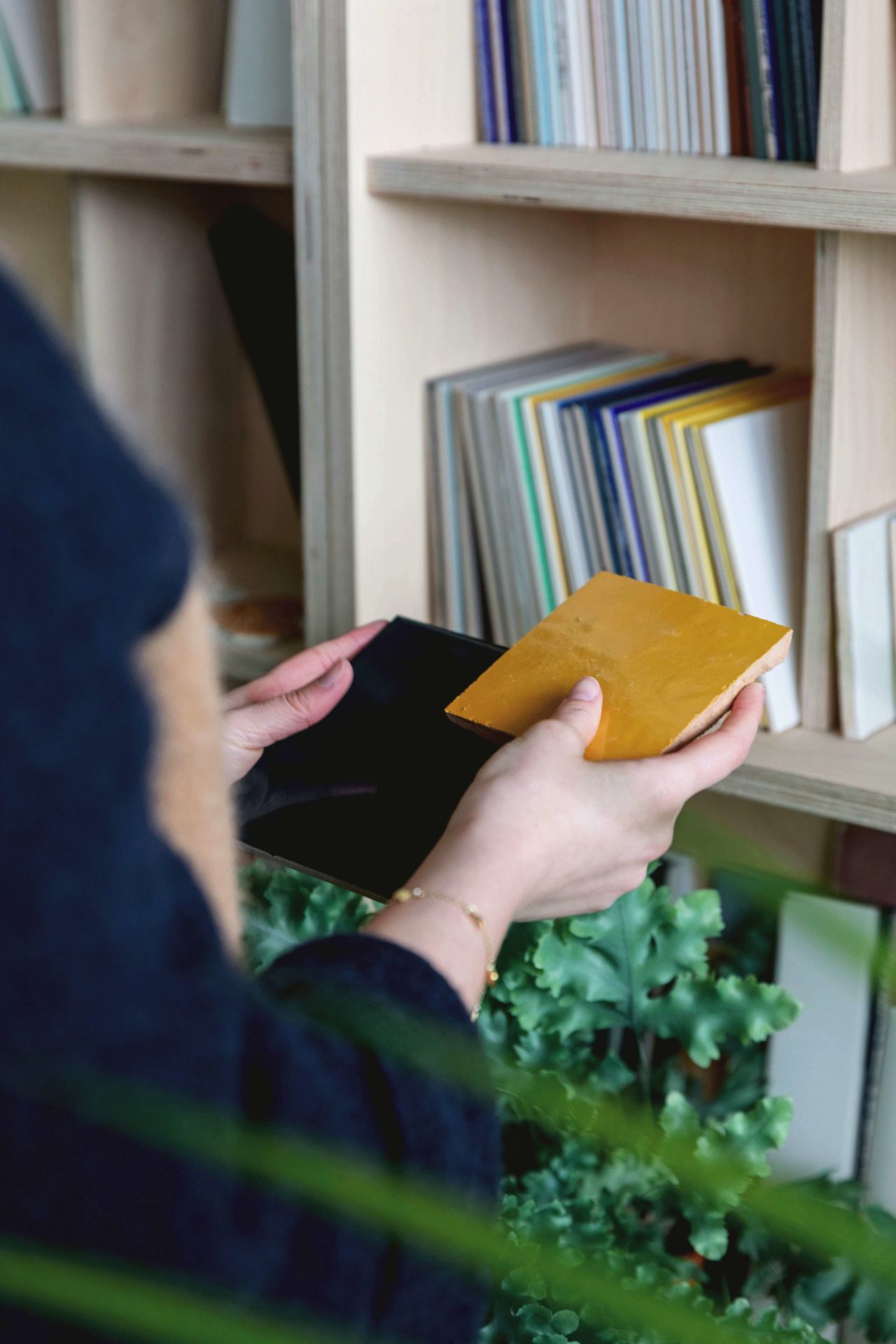
The samples could well have been plucked from another hero piece in the space – a freestanding, floor-to-ceiling sample library, whose evenly spaced compartments house a variety of examples for the three practices to show their clients when discussing materials for new projects. Ross promptly reels off a selection: “There are ceramic tiles, terrazzo, types of timber, metalwork, wallpapers and fabrics as well as up-and-coming sustainable materials, such as mycelium.”
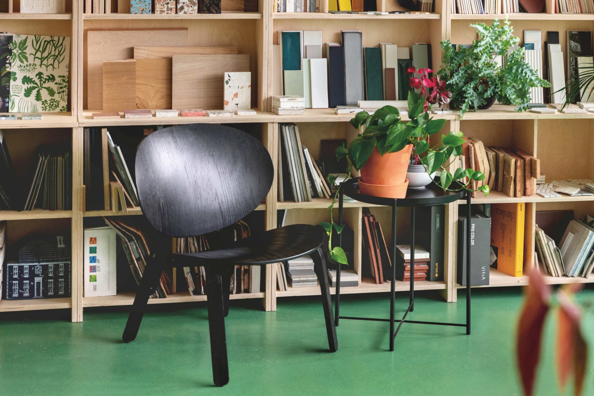
Made of CNC-cut birch plywood, the unit is a striking focal point, as well as being a practical way to store and display materials so they’re clearly visible and easy to remove, feel and examine. The upper half of the unit has evenly spaced cubby holes, the lower half larger compartments shelves’ proportions are a bit like those of a Victorian dresser.”
Overall, Emil Eve, which won a RIBA London Award this year for a residential project in Clerkenwell, London, has created an office space with a light touch, choosing not to alter the fabric of the interior. The walls were freshened up with white paint but, like the floor, these are semi-permanent interventions that can easily be returned to their original colour. “The changes we made were relatively cosmetic,” says Ross, who acknowledges this was partly for ‘budgetary’ reasons.
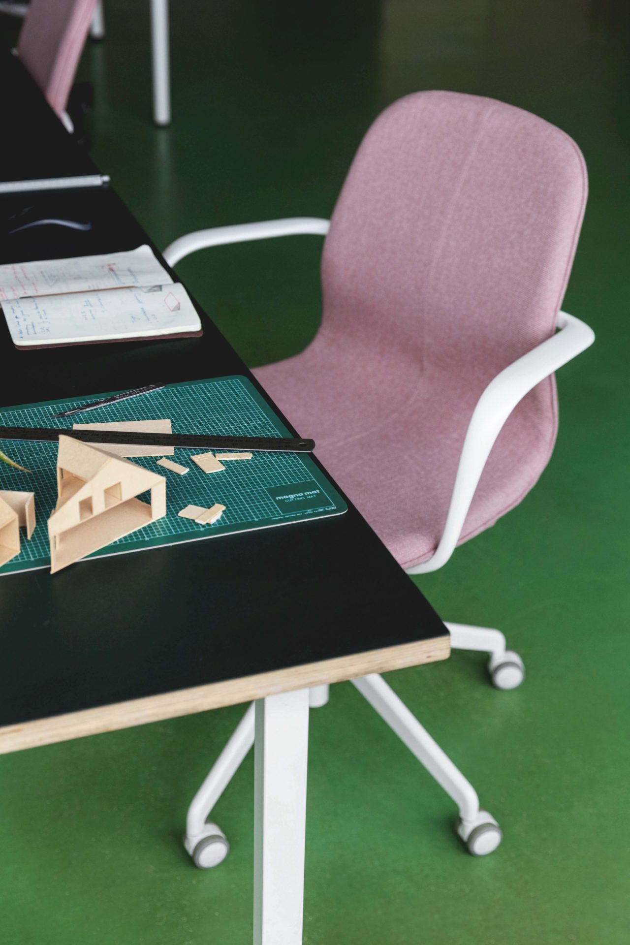
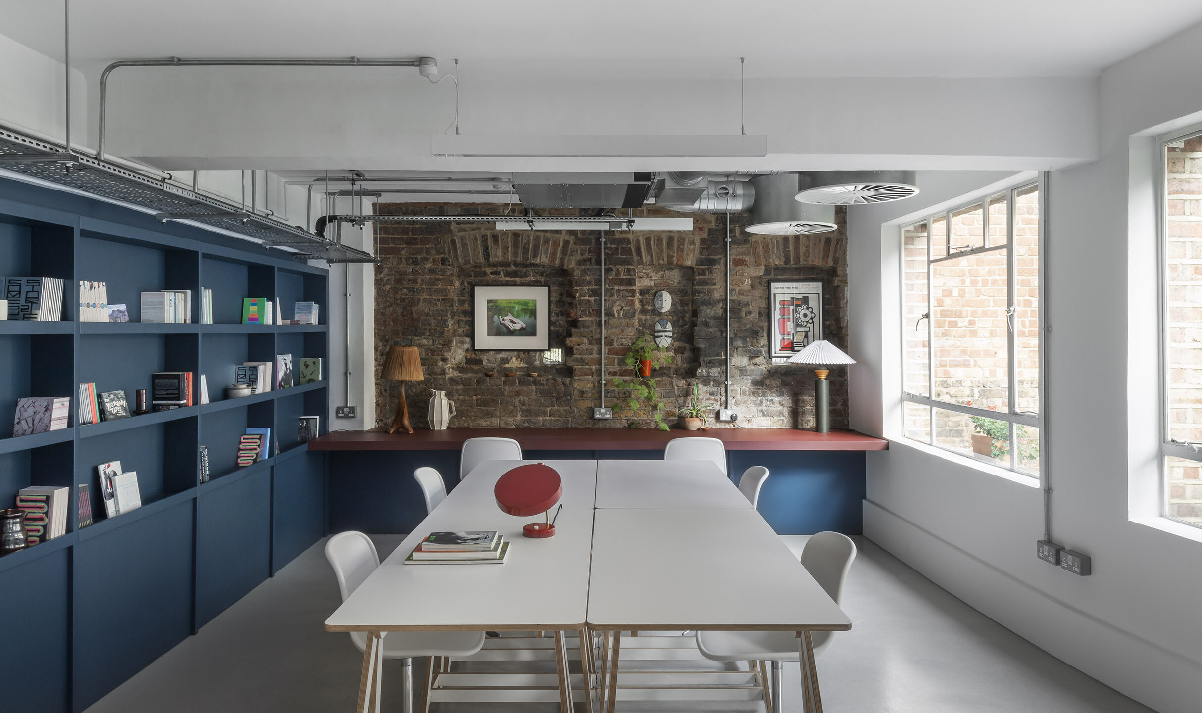
The office is kitted out with free-standing furniture – chairs, desks, tables and modular bookshelves – that not only avoids affecting the fabric of the interior but is flexible, since it can be moved around. Several bookshelves and a tall storage unit are also made of CNC-machined plywood, and come from Suffolk-based firm Natural Buildings Systems.
Utilitarian materials were chosen for other furnishings, too – the birch-ply desks are topped with Forbo linoleum in various colours. “We’ve used paint, colour and graphics to liven up the space,” says Ross. There are blush-pink office chairs – these complement the green floor – and a variety of black chairs, including ones with low-slung seats for people to relax in away from their desks, all sourced from Vitra and Ikea. The black chairs make the brighter colours in the office, especially the green on the floor, sing.
A combination of natural wood tones and colour is a hallmark of Emil Eve’s work: the architects’ London home includes a wooden storage unit that incorporates blue MDF panels. Adding more pops of colour in the office are simply framed abstract prints by Ronan Bouroullec (one half of French design duo the Bouroullec Brothers).
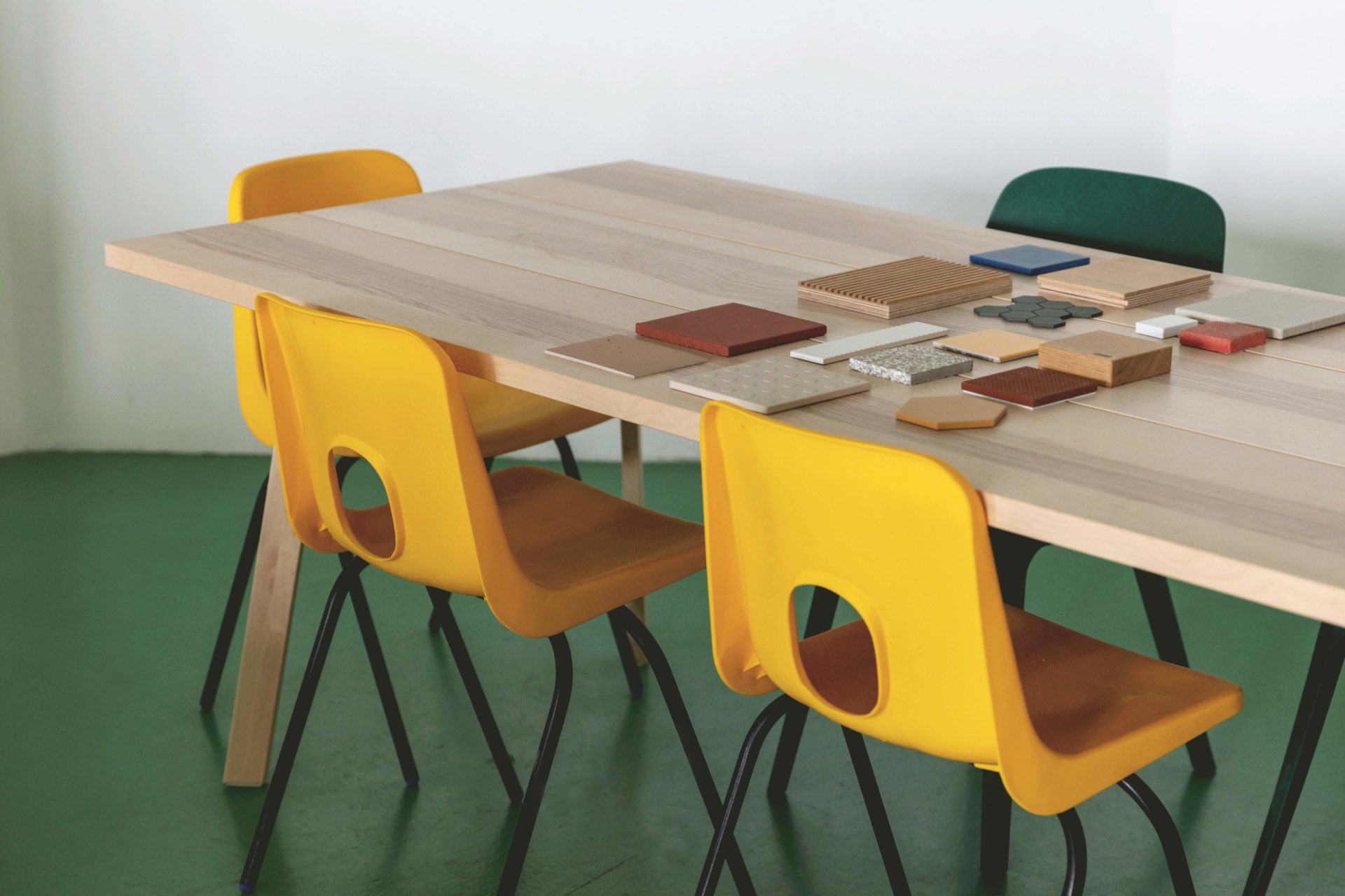
In line with the desire for flexibility, a heavy curtain informally subdivides the interior into two areas. In the larger of these are desks and storage units, in the smaller one, a kitchenette and meeting room with a table surrounded by Robin Day chairs in daffodil yellow and green. “It’s easy to make teas or coffees here for clients during meetings,” says Ross. “We didn’t want a meeting room in a glass box; that seems dated,” he says as an aside. The meeting room-cum-kitchen also has a magnetic board that allows images to be attached to it and repositioned easily.
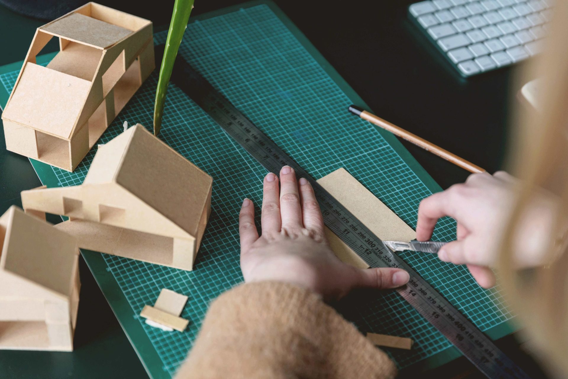
Interior design aside, Perkin talks about the practical and economic benefits of sharing an office. “We share a lot of things, from the sample library to the printer. And we can split the costs of magazine subscriptions and utility bills. We can also rely on others to water the plants when any of us is away. At the moment, we have lots of tomatoes growing indoors. They thrive in the office’s south-facing orientation.”
All three practices had shared an office before in nearby Dalston so, although its members discussed their requirements for the new space. Emil Eve was already aware of each of their essential needs, so decisions about the new design were reached relatively easily. A simply perfect solution.
Images by Mariell Lind Hansen
As featured in OnOffice 160, Autumn 2022. Read a digital version of the issue for free here

